

About Baron Neue Font
I first tried the Baron Neue Font while rebuilding a clean poster system for a local event series. I needed a bold, simple voice that felt confident but not cold. Many geometric typefaces looked either too sharp or too trendy, so I gave this one a careful test across the layout.
What pulled me in was its calm mix of solid structure and open shapes. It slotted nicely into my grid without fighting the imagery. I later wrote about that test on Free Fonts Lab, because the font family behaved more predictably than I expected. That reliability made me curious to explore how far I could push it in real projects.
Font Style & Design Analysis
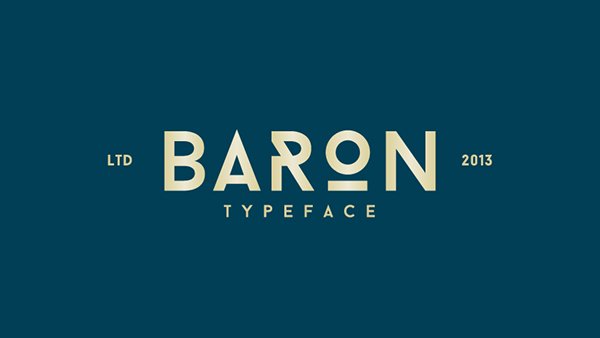
Baron Neue Font is a sans-serif typeface with a clear geometric backbone. The overall silhouette feels straight and upright, with tight vertical strokes and clean joins. There is a subtle industrial tone, yet the wide counters stop it from feeling too stiff. It sits somewhere between minimalist poster lettering and modern editorial typography.
The original release is often shared without clear authorship, so for practical purposes I treat the designer as unknown. That lack of a named foundry does not change how the typeface behaves on the page, but it does mean I pay extra attention to licensing sources and file quality when adding it to a client asset library.
The letterforms have tall proportions, especially in the uppercase, which gives headlines a strong vertical rhythm. Curves on characters like O and C feel quite circular, echoing classic geometric font style traditions. Spacing is on the tighter side, so I usually open the tracking slightly for small text. The mood is assertive and urban, great for titles, but the narrow forms can limit long reading passages. As a sans-serif display face, it shines when used with intention and generous breathing room.
Where Can You Use Baron Neue Font?
I find Baron Neue Font most effective in bold, short messages. Posters, event graphics, and cover designs benefit from its tall, punchy caps. At large sizes, the geometry feels crisp and controlled, which helps build a strong visual identity. It works especially well when the rest of the layout stays simple and grid-based.
On screens, the typeface holds up nicely for hero text, banners, and UI sections that need clear labels. Below about 14px, the tight spacing and rigid shapes start to feel cramped, so I avoid it for long copy or dense tables. Pairing it with a softer serif or a humanist sans-serif in the body text creates a helpful contrast in tone and reading comfort.
Branding projects with a modern, slightly technical character can use this font family for logos, wordmarks, and taglines. I often test it in all caps with wide tracking for packaging or merchandise. For youth-focused work or street-inspired concepts, it brings a structured energy without drifting into comic or playful territory. Used sparingly, it can anchor a system without overwhelming supporting typefaces.
Font License
The licensing for Baron Neue Font can vary depending on where you obtain it, so I never assume it is free for commercial projects. I always check the original source for clear terms covering print, web, and app use. For any client work, I recommend confirming usage rights in writing before adding it to production files. My own takeaway: it is a strong display option when you respect its limits and treat the licence with the same care as the design.


Leave a Reply