
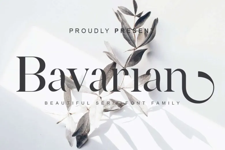

About Bavarian Font
I first tried Bavarian Font while working on a heritage-inspired beer label for a small local brand. The client wanted something rooted in tradition, but still easy to read and friendly to modern eyes. I needed a serif that felt strong, calm, and slightly old-world without turning into full blackletter drama.
That is when this typeface caught my attention in the Free Fonts Lab archive. The shapes had a quiet confidence and a clear nod to European print history. I decided to test it in headlines, subheads, and short text blocks to see how it behaved across a simple visual identity system.
Font Style & Design Analysis
Bavarian Font is a serif typeface with firm, structured forms and a subtle historical flavour. The strokes feel sturdy, with clear contrast between thick and thin lines, giving each word a stable, grounded look. The overall font style leans traditional, yet the clean curves keep it from feeling dusty or overly decorative.
The designer of this font is designer unknown, which is often the case with many free historical-inspired fonts. Still, the work behind it feels careful. The spacing, proportions, and basic rhythm suggest that someone with a good eye for classic typography guided the shapes, even if we do not have a name to attach.
The letterforms show sharp, defined serifs, especially on the capitals, which give titles a clear, ceremonial tone. Lowercase letters stay compact, with moderate spacing that works best at medium to large sizes. The rhythm is quite rigid, so long paragraphs can feel heavy. It shines in headlines, logos, and short pull quotes, but it is less suited to dense body text or very small captions.
Where Can You Use Bavarian Font?
I see Bavarian Font working very well in projects that need a sense of place, craft, or heritage. Think beer labels, artisan food packaging, rustic restaurants, or regional tourism brochures. At large sizes, the serif details show nicely and give the typography a serious but welcoming tone that many traditional brands look for.
In my tests, it behaved best between display and subheading sizes. At very large headline sizes, it has presence without shouting. At medium sizes on posters or menus, it still feels sharp and clear. Once it drops too small, the fine stroke contrast and tight counters make legibility a bit risky, especially on low-quality print.
For pairing, I prefer to match this serif with a clean, neutral sans-serif for body text, something simple that lets the decorative flavour sit only in titles. It also works nicely when used as a single strong headline line above simple photography or textured backgrounds. Used with restraint, it can anchor a visual identity and signal tradition without feeling stiff.
Font License
The licence for Bavarian Font may differ between personal and commercial use, so it is important not to assume anything. Before using it in client work, branding, or products for sale, always review the official licence details from the original source and confirm that your planned usage is allowed.
For me, Bavarian Font is a tool I reach for when I need a grounded, traditional serif with a regional mood. Used carefully and in the right context, it adds character without taking over the design.


Leave a Reply