

About Beast Font
I first tried Beast Font while working on a bold poster series for a small gaming event. I needed something clean, strong, and easy to read at a distance. Many options felt either too plain or too wild, so this one sat in an interesting middle space that made me curious.
I tested it across several layouts for titles, side labels, and short taglines. As I adjusted sizes and weights, I saw how it handled contrast and spacing in real use. That hands-on process, plus some extra trials for Free Fonts Lab mock-ups, gave me a clear sense of where this typeface shines and where it needs a bit more care.
Font Style & Design Analysis
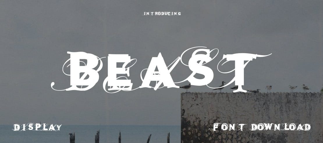
Beast Font is a sans-serif typeface with a clear, modern stance. The strokes feel solid and steady, with a slightly condensed build that saves horizontal space. It has a firm, grounded presence, which makes it feel confident without turning into a loud display stunt. The overall look leans more practical than decorative.
The original designer is unknown, at least from what I could verify with normal research. That lack of background forces me to judge it purely by performance, not by name or reputation. In a way, this keeps my focus on the actual shapes, consistency, and how the font family behaves across different settings.
The letterforms are quite geometric, with simple terminals and little contrast between thick and thin parts. Spacing is fairly tight by default, especially in uppercase, so I often add a touch of tracking for headlines. The rhythm feels stable, which helps longer words stay readable. Its strength lies in bold titles and mid-length text, but it can feel slightly stiff in very long paragraphs.
Where Can You Use Beast Font?
In my tests, Beast Font worked nicely for posters, gaming graphics, and tech-flavoured branding. The sans-serif structure keeps everything clean, while the firm shapes give logos and titles a serious tone. It also suits app splash screens, dashboard headings, and covers where you want strength without heavy decoration.
At large sizes, the font style holds edges well and stays sharp, even on lower-quality displays. For small body text, I found it usable but only with enough line spacing and careful contrast. On screens, I prefer it for captions, UI labels, and short paragraphs rather than full articles, as the tight spacing can feel slightly dense.
Beast Font pairs best with a softer companion typeface. I like matching it with a humanist sans or a simple serif for body copy, to balance its rigid geometry. In layouts, I often reserve it for headings, subheads, and callouts. Used this way, it builds a clear visual hierarchy and supports a strong, focused visual identity.
Font License
The licence terms for Beast Font can change depending on the source, so I never assume anything. Before using it in client or commercial work, I always double-check the current licence details at the original distribution point. That quick step protects both my projects and my clients.
As a designer, my honest take is simple: Beast Font is worth testing when you need a solid, no-nonsense sans-serif with a firm voice, as long as you respect its limits and tune the spacing with care.


Leave a Reply