
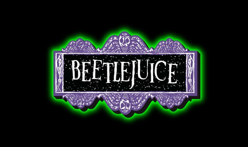

About Beetlejuice Font
I first reached for the Beetlejuice Font while working on a spooky film night poster. The client wanted something loud, strange, and clearly inspired by classic horror titles. I needed a logo font that felt theatrical, not just “scary”, and this typeface instantly stood out from the usual choices.
As I tested it, the font gave me a strong mix of fun and eerie energy. The letterforms felt playful but also a bit unsettling, which suited the mood very well. I later explored it more deeply for my review on Free Fonts Lab, focusing on how it behaves in real layouts and branding work.
Font Style & Design Analysis
The Beetlejuice Font is a pure logo font, built for bold wordmarks and titles, not for long text. Its design direction leans into horror-comedy, with exaggerated shapes and a slightly unstable rhythm. The letters feel like they belong on a vintage supernatural movie poster, with high contrast and strong silhouettes.
The exact origin of this font is unclear, so I treat it as designer unknown. It is clearly based on the famous film’s title styling, echoing that cult visual identity. Because of this, the font family carries strong pop culture baggage, which can help or hurt a project depending on intent and context.
The letterforms have stretched curves, sharp inner corners, and irregular widths that create a jittery texture. Spacing is fairly tight by default, giving compact, punchy logos. The mood is campy, eerie, and dramatic rather than serious or elegant. Its strength lies in short words and short phrases. It becomes tiring and messy when overused, especially in dense copy or complex layouts.
Where Can You Use Beetlejuice Font?
I see the Beetlejuice Font working best as a logo or main headline for horror, Halloween, or quirky fantasy themes. It shines on posters, streaming thumbnails, event branding, and title cards. At large sizes, the strange curves and bold contrast read clearly and add strong character in a single glance.
At smaller sizes, some of the fine angles and inner spaces begin to blur, especially on low-resolution screens. For that reason, I avoid using it for body text or UI labels. I usually pair it with a simple sans-serif or serif typeface to handle long copy. This keeps the layout readable while letting the logo font carry the drama.
The font style speaks well to younger audiences, horror fans, and people who enjoy retro cult aesthetics. It works nicely for seasonal campaigns, haunted house branding, party invites, and parody covers. Used sparingly, it can also add a playful edge to packaging or social graphics, as long as the rest of the typography remains calm and supportive.
Font License
Before using the Beetlejuice Font in client work or commercial projects, I always check the licence from the original source. Some versions may allow only personal use, while others might permit broader usage. It is important to read the terms carefully and confirm that your specific use is fully covered.
My honest takeaway as Ayan Farabi: this font is a fun, niche tool. I use it rarely, but when the brief calls for eerie, campy logo energy, it delivers a very specific mood that few other options match.


Leave a Reply