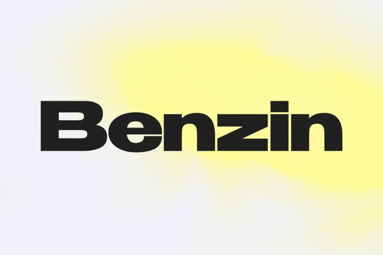
About Benzin Font
I came across Benzin Font while I was searching for a clean typeface for a tech landing page. I needed something firm, modern, and easy to scan, but not cold or boring. The name caught my eye first, but the shapes kept me looking.
As I tested it for layouts at Free Fonts Lab, I liked how steady the rhythm felt. The font family looked flexible enough for both headlines and short blocks of text. I decided to put it through real interface mock-ups, social posts, and a dark mode dashboard to see how the typography behaved under pressure.
Font Style & Design Analysis
Benzin Font is a sans-serif typeface with a very controlled, geometric feel. The lines look straight and confident, but the corners are not overly sharp. This gives the font style a clear, technical mood, yet it still feels readable and balanced on the screen.
The designer is unknown, at least from the sources I could track down while testing it. That did not stop me from treating it like any serious typeface, though. I checked how the font family behaves in grids, in responsive layouts, and across different weights and alignments.
The letterforms have even proportions, with a steady x-height that helps legibility on digital interfaces. Spacing feels slightly tight by default, which works well for bold headlines but may need a touch of tracking for body text. The rhythm is calm and mechanical, which suits structured layouts. As a sans-serif, it handles numbers, labels, and UI text nicely, but long essays or book-style reading feel a bit stiff.
Where Can You Use Benzin Font?
I found Benzin Font most comfortable in branding for tech, apps, and modern products. It works well for logos that need a strong, simple word-mark with minimal decoration. On posters or banners, large sizes show its clean geometry and clear edges without breaking apart.
On small screens, the typeface stays readable, especially in medium weights. Interface labels, buttons, and charts all look tidy. For very small sizes, I suggest avoiding the thinnest weight and adding a little extra letter spacing. The font family responds well to grid-based layouts, especially when margins and padding are consistent.
The font style pairs nicely with a softer serif for long text, or with a humanist sans for body copy. I often use Benzin Font for headings and navigation, then bring in a warmer companion below. It suits audiences who expect clarity and structure, like tech users, design-aware brands, and product-focused teams.
Font License
Before using Benzin Font in any paid or client project, please check the licence from the original source. Terms for personal and commercial use can change over time. I always confirm the current licence details so the typography stays safe and compliant.
For me, Benzin Font has become a solid option when I need a clear, modern base for digital design, as long as I handle spacing and pairing with care.


Leave a Reply