
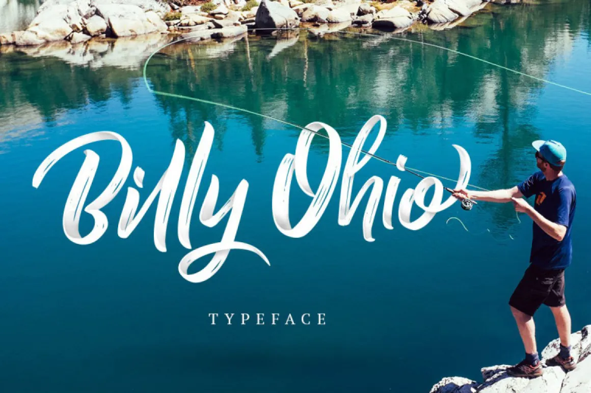

About Billy Ohio Font
I came across the Billy Ohio Font while working on a bold poster for a local music event. I needed something loud, fast, and a bit messy, but still readable from a distance. This brush style caught my eye because it felt energetic without looking cheap or forced.
I decided to test it further for a Free Fonts Lab mock branding project. I wanted to see how this typeface behaved in real layouts, not just in pretty previews. The raw, painted strokes looked promising for lifestyle brands, streetwear, and creative campaigns, so I took it through logos, headings, and social graphics.
Font Style & Design Analysis
The Billy Ohio Font is a pure brush typeface with a strong hand-painted look. The letters feel like they were made with a thick marker or rough brush on paper. Strokes are bold and slightly uneven, which gives the font family a natural, human energy. It aims more for impact and mood than for quiet elegance.
The exact creator of this font is designer unknown, at least from the sources I could confirm. That limits deeper insight into the original design intent. Still, the visual direction is very clear. It fits the modern trend of expressive, brush-based display typefaces often seen in street graphics and social media covers.
The letterforms are wide, with strong diagonals and clear stroke contrast, so the typography feels fast and dynamic. Spacing is tight by default, which helps for bold headlines but can get cramped in longer words. The rhythm feels punchy, almost like graffiti tags. It works best in short phrases. For fine print or long paragraphs, the rough details and busy shapes become tiring and reduce clarity.
Where Can You Use Billy Ohio Font?
I see the Billy Ohio Font working best in branding where attitude matters more than polish. Streetwear labels, music festival posters, energetic sports campaigns, and youth-focused ads can all benefit from this brush style. It speaks to a casual, bold audience that is comfortable with expressive, imperfect typography.
At large sizes, the brush texture and heavy strokes really shine. Headlines, hero banners, social media covers, YouTube thumbnails, and product packaging are all strong use cases. At small sizes, though, the rough edges and tight spacing can merge together. For body copy or long captions, I always pair it with a clean sans-serif to keep the layout readable.
In mixed layouts, I like pairing this brush typeface with simple geometric or humanist sans families. Let Billy Ohio handle just one or two key words in a line, then support it with calmer fonts. Side-by-side with photos or gritty textures, the font style adds punch without needing heavy graphic effects. Used with care, it can give a brand a strong visual identity without feeling like a gimmick.
Font License
Licensing for the Billy Ohio Font can vary between sources, so I never treat it as automatically free for commercial work. It is fine for quick tests and personal experiments, but for client projects or paid campaigns, I always check the official licence details and confirm permissions before final use.
My honest take as a designer: Billy Ohio is great when you need loud, brush-style energy in short bursts. I reach for it when a project needs personality fast, but I keep it in check and always support it with cleaner type for balance.


Leave a Reply