
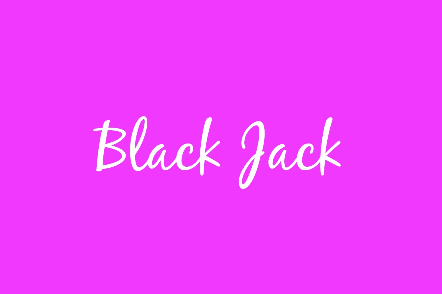

About Blackjack Font
I first tried Blackjack Font while working on a relaxed café rebrand that needed a friendly script logo. The brief called for something casual, readable, and a bit playful, without drifting into cartoon style. I wanted a script that felt handwritten but still clean enough for menus and simple packaging.
As I tested options for that project at Free Fonts Lab, Blackjack stood out for its easy rhythm and warm personality. It looked confident without being loud. I decided to put it through a full trial: logo sketches, social media titles, and some short taglines, just to see how far this font family could stretch in everyday design work.
Font Style & Design Analysis
Blackjack is a script typeface with a smooth, informal flow that feels close to quick marker handwriting. The strokes are slightly bouncy but not wild, so lines stay steady and easy to follow. You get rounded curves, soft terminals, and a relaxed baseline that gives text a friendly, human touch without looking messy or forced.
The designer of Blackjack Font is commonly credited as Rian Hughes, known for expressive, character-driven type. You can see that experience in the way each letter connects with care. The script category roots are clear, but it stays more controlled than many brush-style designs. It feels designed for real-world use, not only for showy titles.
The letterforms are open, with generous counters that help legibility at medium sizes. Spacing is fairly tight by default, which works well for logos and short headlines, though I sometimes add a bit of tracking for breathing room. The rhythm is smooth and consistent, giving words an easy, handwritten flow. It shines in short phrases, names, and branding work. Long paragraphs, however, can feel tiring, so I avoid using it for large text blocks or dense layouts.
Where Can You Use Blackjack Font?
In real projects, I find Blackjack Font works best as a display script for friendly brands. It suits cafés, bakeries, casual fashion labels, handmade goods, and lifestyle blogs that want a personal voice. At larger sizes, the script curves feel warm and inviting, making it a solid choice for logos, packaging, and cover headlines.
At medium sizes, like subheadings or social media graphics, the script category traits stay clear and readable, as long as you keep words short. I often pair Blackjack with a clean sans-serif for body text to balance the playful script style. This mix keeps the visual identity approachable while maintaining clarity for menus, product details, or website copy.
At small sizes, the thin joins and tight spacing can start to blur, especially on screens or low-quality print. For that reason, I avoid using it for captions or long text lines. Instead, I treat Blackjack Font as an accent voice: logo marks, short quotes, name lines, or emphasis words in a layout. Used this way, it adds warmth without taking over the whole design.
Font License
Licensing for Blackjack Font can vary depending on the source, so it is important not to assume usage rights. Before using it in commercial branding, client work, or products for sale, always check the current licence terms from the official distributor and confirm that both personal and commercial use are clearly allowed.
For me, Blackjack remains a reliable choice when I need a relaxed, legible script that feels human but still controlled. Used with restraint and paired with a clean supporting typeface, it can anchor a friendly visual identity without shouting.


Leave a Reply