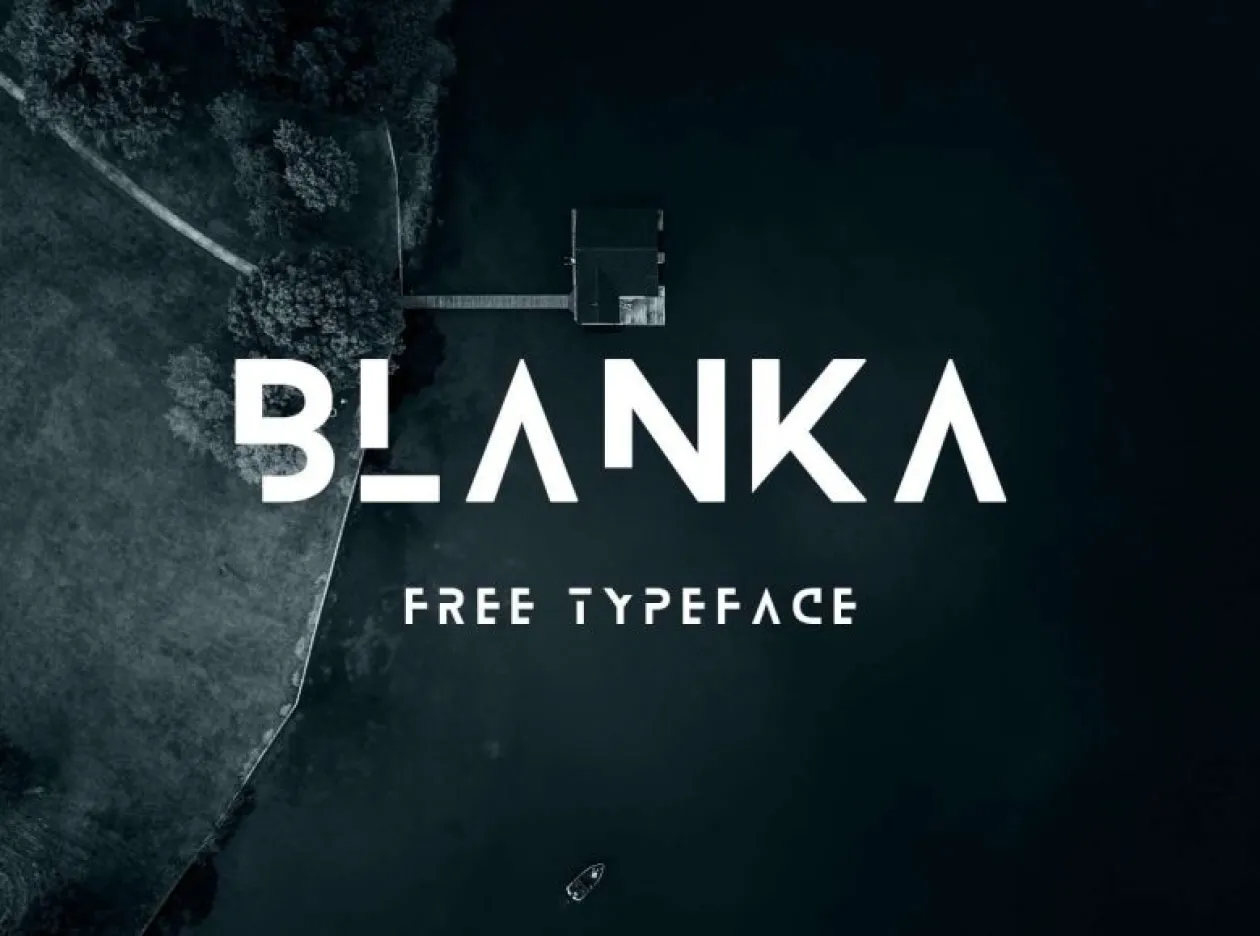
About Blanka Font
I came across Blanka Font while searching for a bold, futuristic typeface for a personal poster project. I wanted something clean, minimal, and a little mysterious, without feeling like a cliché sci-fi font. Its broken shapes and strong geometry caught my eye right away and made me pause.
I decided to test it in a few layouts for Free Fonts Lab, mainly for titles and hero graphics. I was curious to see how its gaps and sharp lines would behave in real compositions. On first use, it felt striking and controlled, but also quite specific in mood, which can be both a strength and a limit.
Font Style & Design Analysis
Blanka Font is a display typeface, and it commits fully to that role. The design leans on geometric forms, sliced strokes, and open shapes that suggest missing lines. This creates a futuristic, almost digital feeling. It is not neutral at all; it arrives with a ready-made mood that dominates any layout.
The designer of this font is widely listed as Emmeran Richard; if you see a different credit somewhere else, treat it with care. The design shows a clear concept: reduce each letter to its simplest structure, then remove key parts. This approach gives the font family a very recognisable voice and sets it apart from more generic sci-fi styles.
The letterforms use consistent geometry, with even stroke widths and careful curves. The spacing feels quite tight, which works well in large headlines but can close up in smaller sizes. Because of the missing strokes, some characters become less legible when scaled down or tracked too tightly. The mood is sleek, tech-driven, and a bit distant. It shines in short words and single-line titles but struggles with long text or complex copy.
Where Can You Use Blanka Font?
Blanka Font works best in bold display settings where you need instant impact. Think posters, event titles, music covers, tech branding, or portfolio headlines. When you set it large, the broken strokes feel intentional and stylish, and the eye has enough time to complete the shapes without strain.
In smaller sizes, the gaps in the letters start to hurt readability, especially on low-resolution screens or busy backgrounds. I would avoid using it for body text, captions, or UI labels. It feels more at home in editorial spreads, landing page hero sections, and motion graphics where the typography can stay big and bold.
For pairing, I had good results combining this display typeface with a simple sans-serif for body copy. A calm, neutral companion helps ground the futuristic look and supports a clear visual hierarchy. Keep colour palettes simple and layouts spacious; clutter tends to fight its sharp geometry. Used with restraint, it can give a visual identity a distinct, tech-forward edge.
Font License
The licence for Blanka Font can vary depending on where you obtain it, so it is important not to assume usage rights. Always review the current licence on the official source before using it in commercial work, client branding, or large campaigns. For safety, I only use it commercially after clear written permission. My personal take: strong for concept-driven work, but best reserved for projects that truly match its futuristic voice.


Leave a Reply