
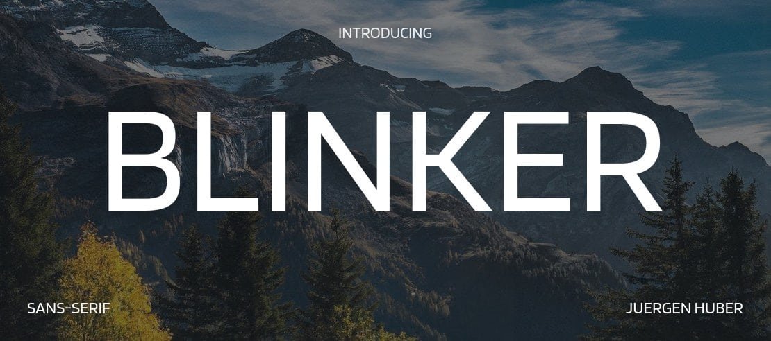

About Blinker Font
I first tried Blinker Font while designing a clean interface for a dashboard concept. I needed something calm, modern, and easy to scan at speed. Many options felt either too stiff or too playful, but this typeface sat nicely in the middle. That balance made me curious enough to test it more seriously.
As I explored the full font family, I noticed how steady and unfussy it felt. The shapes did not shout for attention, yet they stayed clear in busy layouts. That quiet confidence made it a good candidate for long-term use. I later wrote about my notes for Free Fonts Lab, after trying it across several screen sizes.
Font Style & Design Analysis
Blinker Font is a sans-serif typeface with a very stripped-back voice. Strokes stay mostly even, with gentle curves and tidy terminals. The overall font style feels contemporary, but not cold or harsh. It reminds me of modern UI typography that aims to disappear and let the content lead the visual story.
From what I could confirm, the designer information is not clearly credited, so I will treat it as designer unknown. That said, the work shows a careful hand. The font family feels consistent weight to weight, and the shapes suggest a strong focus on digital environments rather than print-first thinking.
The letterforms are open, with generous counters and clear distinctions between similar shapes like “I”, “l”, and “1”. Spacing feels slightly on the loose side, which helps at small sizes and on bright screens. The rhythm of text looks steady in paragraphs, with no odd dark spots. The mood leans neutral and pragmatic, which is a strength for UI and product design, but less ideal if you want a very expressive logotype. As a sans-serif workhorse, it behaves best when content clarity matters more than personality.
Where Can You Use Blinker Font?
I find Blinker Font particularly useful in digital products, dashboards, and web interfaces. At small sizes, the open shapes stay readable, even on lower-quality screens. Navigation labels, buttons, tooltips, and small meta data all hold up well. In these roles, the neutral typography supports the interface without drawing focus away from the core tasks.
At larger sizes, like section headings or hero text, the typeface still looks clean, but it does not carry a strong brand voice on its own. I often pair it with a more characterful display or serif typeface for logos or headlines, then keep Blinker Font for body copy and UI elements. This mix creates a solid visual identity while maintaining clarity in longer reading.
For audiences, it suits tech products, SaaS dashboards, educational platforms, and minimalist portfolios. It also works in simple presentations and infographics where labels need to be very clear. I would be more careful using it for editorial layouts, posters, or expressive branding, unless the concept calls for something extremely neutral. In those cases, the calm tone can still serve well as supporting text.
Font License
Licensing terms for Blinker Font can change, so please do not assume anything about personal or commercial use. Before using it in client work, branding, or products, always read the current licence on the official source. I treat that step as part of my normal design process.
My honest takeaway as Ayan Farabi: Blinker Font is a quiet, reliable choice when clarity and function matter more than showiness, especially in modern digital interfaces.


Leave a Reply