
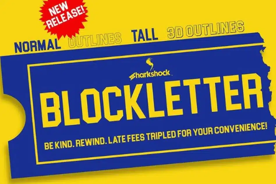

About Blockletter Font
I first picked up Blockletter Font while working on a retro game poster that needed clean, bold text. I wanted something strong, simple, and easy to read, but not too fancy or trendy. The name caught my eye, and the shapes felt familiar, almost like classic sign lettering.
As I tested it in the layout for Free Fonts Lab, I noticed how quickly it settled into the design. The font did not fight with the artwork. Instead, it framed the visuals in a clear, confident way. That balance between impact and clarity made me curious enough to explore it in other projects.
Font Style & Design Analysis
Blockletter Font is a sans-serif typeface with a solid, blocky presence and very little decoration. The strokes are mostly uniform in weight, which gives the font family a strong, steady rhythm. It leans towards a square, constructed look, but it still feels friendly enough for general use, not just strict technical layouts.
As far as I can confirm, the designer is unknown, which fits how this typeface behaves: simple, direct, and not trying to show off. It feels like something you might see on packaging, posters, or clear labels. That quiet anonymity can actually help when you want the message, not the font style, to be the star.
The letterforms have straight sides, tight curves, and clear counters, so the words lock together neatly. Spacing is fairly tight by default, which works well for headlines and short lines of text. In long paragraphs, you may want to loosen the tracking a bit. The mood is bold and practical, but it is not very expressive, so it is less suited to emotional or delicate branding.
Where Can You Use Blockletter Font?
I find Blockletter Font most useful in projects that need clear, strong typography without visual drama. It works well for posters, banners, labels, and UI titles where fast reading matters. At large sizes, the blocky shapes feel confident and stable, especially when you keep plenty of negative space around the text.
In smaller sizes, the sans-serif structure helps a lot, because there are no extra details to blur or clutter. Still, I would avoid very small body text, as the uniform strokes can start to feel a bit heavy. Short paragraphs, captions, and buttons are fine. For longer reading, I usually pair it with a softer serif or a more open sans.
For branding work, I have used this typeface on mock logos and sports-themed graphics. It suits tech, gaming, streetwear, and industrial products quite well. When pairing, a light, airy secondary font can balance the blocky weight. I often place Blockletter Font in headlines and use a calmer companion font for body copy to maintain a clear visual hierarchy.
Font License
Before using Blockletter Font in client or commercial work, always check the current licence from the official source. Usage terms can change over time, and personal use does not always cover paid projects. I make a habit of verifying permissions for every new project, and I recommend you do the same.
My honest takeaway as Ayan Farabi: Blockletter Font is a reliable, no-nonsense choice when you need strong, readable type without extra personality getting in the way.


Leave a Reply