

About Blow Brush Font
I first tried the Blow Brush Font while working on a bold poster for a streetwear brand. The client wanted something loud, hand-made, and full of movement. My usual brush scripts felt too clean, so I went hunting for something rougher and more energetic.
When I found it, the chunky strokes and messy edges caught my eye right away. It looked like real marker ink on paper, not a polished digital script. I decided to test it in a few layouts for Free Fonts Lab and see how it behaved in real design work, not just pretty previews.
Font Style & Design Analysis
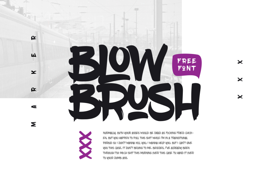
The Blow Brush Font is a script typeface with a heavy, graffiti-inspired voice. It feels like quick lettering made with a thick permanent marker. Letters lean forward with strong energy, and the strokes have a rough, dry texture that adds grit. It clearly aims for a street art, urban, and DIY mood.
The original brush style points to a designer who understands graffiti culture and hand lettering, but the exact creator is not clearly credited, so for now I would note the designer unknown. From a user view, the font family is simple, with one main font style focused on impact rather than range.
The letterforms are wide, with big rounded counters and slightly irregular curves that give a casual rhythm. Baseline flow is loose, so words feel alive rather than strictly aligned. Spacing is tight by default, which works well for large headlines but can feel cramped in long words. Its strength lies in short, punchy phrases; it struggles with body text or any very small size because the texture starts to blur and hurt readability. As a script brush font, it shines when you let it stay loud and uncluttered.
Where Can You Use Blow Brush Font?
In real projects, I find the Blow Brush Font works best for bold display typography. It fits streetwear branding, music covers, event posters, and social media graphics aimed at younger, urban audiences. At large sizes, the rough ink texture becomes a design element by itself and adds character to the whole visual identity.
On smaller screens or tiny text, it loses clarity fast, so I only use it for headlines, tags, or short calls to action. For supporting text, I usually pair it with a clean sans-serif typeface to balance the chaos. This contrast keeps layouts readable while letting the script voice handle emotion and attitude.
It also suits handmade product labels, skate or graffiti-themed artwork, and bold logo sketches where you want a quick, expressive mark rather than perfect geometry. When I design with it, I leave plenty of white space around the words so the brush strokes can breathe. Too many effects or busy backgrounds fight with the strong script shapes and make the message harder to catch.
Font License
Licensing for the Blow Brush Font can change depending on where you get it. Always check the official source for the latest licence terms, especially for commercial projects. I only use it commercially after reading the licence carefully and making sure both personal and client use are clearly allowed.
My honest take as Ayan Farabi: this font is powerful in the right context, but it needs careful, intentional use to avoid visual noise.


Leave a Reply