
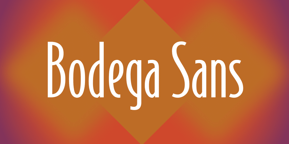

About Bodega Sans Font
I came across Bodega Sans Font while working on a clean layout for a café concept. I needed a typeface that felt modern but not cold, something simple enough for menus and posters, yet still with a bit of personality. The name caught my eye first, but the shapes kept me interested.
I tested it across a few mockups for Free Fonts Lab, mainly for headings and short text blocks. I wanted to see if it could handle both bold, attention-grabbing titles and calm, readable copy. It held up well in both roles and made me curious to explore it more deeply.
Font Style & Design Analysis
Bodega Sans Font is a clean sans-serif font family with a straightforward, modern voice. The design feels balanced and neutral, but there is a quiet confidence in the forms. It does not try to look quirky or retro. Instead, it focuses on clarity, making it a good base for many visual identity systems.
The designer is unknown, at least from the sources I could check. In cases like this, I pay more attention to how the typeface behaves in real layouts. Without a famous foundry name behind it, the design still needs to stand on its own. Here, the structure, rhythm, and general consistency gave me enough trust to use it in tests.
The letterforms are open and slightly wide, which helps with legibility at smaller sizes. Strokes feel even, and curves are smooth without sharp surprises. Spacing is on the safer side, not too tight, which keeps words easy to scan. This sans-serif works well for calm, clear typography, but it is less suited to highly expressive, artistic displays. For those, you may want a more distinctive font style as a partner.
Where Can You Use Bodega Sans Font?
I see Bodega Sans Font working well in branding for cafés, simple product labels, and lifestyle blogs. It has enough personality to stand on a shopfront sign, yet it does not shout. For headers on posters, menus, and slides, the font family feels steady and trustworthy, especially when paired with soft colours and plenty of white space.
In large sizes, the clean letterforms show nicely. The round shapes feel friendly, and the straight lines keep the mood professional. For long paragraphs, I would test it carefully. While it stays readable, the texture might feel a bit plain for very long reading on print. It performs better for medium-length copy, UI labels, and supporting text.
For pairing, I like using Bodega Sans Font with a warm serif for body text or a subtle script accent for logos and signatures. It can act as the calm, grounding typeface in a layout while another font adds flair. If you build a visual identity that targets modern, urban, or minimal brands, this sans-serif gives you a stable foundation.
Font License
From what I could verify, licence terms for Bodega Sans Font are not completely clear across all sources. Do not assume it is free for commercial projects. Before you use it in client work or products, always check the official licence details and permissions from the original provider.
My personal takeaway as Ayan Farabi: this font is a quiet, reliable option when you need clean structure without strong stylised drama. It will not define a brand on its own, but it can support many projects with steady, honest typography.


Leave a Reply