

About Bogue Font
I first tried Bogue Font while testing options for a small lifestyle brand logo. The client wanted something relaxed but not childish, and nothing too sharp or techy. I needed a typeface that felt friendly, casual, and a bit retro, yet still readable in small social media graphics.
During that project, I used it in mockups for packaging, Instagram posts, and a simple wordmark. It gave the brand a soft, human voice without looking messy. For designers who enjoy exploring characterful fonts on Free Fonts Lab, this one sits in that sweet spot between playful and practical.
Font Style & Design Analysis
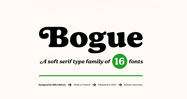
From my tests, I would place Bogue Font in the serif category. It behaves like a relaxed display serif rather than a strict text face. The strokes feel smooth and easy, and the overall typography leans towards lifestyle, crafts, and cosy visual identity work.
The designer is unknown, at least from the sources I checked. That said, the font family feels consistent, which suggests a careful hand behind it. The weight and flow of the letters feel deliberate, like someone sketched them with a brush pen and then cleaned them up digitally without losing the original movement.
The letterforms have rounded curves and gentle entry strokes, with a nice rhythm from character to character. Spacing is fairly tight by default, so I often add a touch of tracking for headlines. It shines in short words and phrases. Longer blocks of text feel busy, so I keep it for titles, tags, and logo-style marks where personality matters more than calm reading.
Where Can You Use Bogue Font?
In my work, Bogue Font has worked best in branding for coffee shops, small boutiques, and handmade product labels. It gives packaging and logo lockups a warm, personal tone. When I scale it up for posters or banners, the curves stay clean, and the script style holds its charm from a distance.
Digital use is also quite solid. On social media templates, story covers, and YouTube thumbnails, the handwritten feel helps messages stand out. I avoid setting long captions with it, but for headers and short phrases, it reads clearly even on mobile screens. It suits audiences who enjoy crafted, lifestyle-led visuals.
For print, I have used it on thank-you cards, swing tags, and event invites. On textured paper, the friendly strokes almost feel printed from a real brush script. I would not pick it for formal corporate work or serious editorial layouts. It simply speaks better in relaxed, creative, or personal design contexts where a human voice matters.
Font License
From what I could confirm, licensing terms for Bogue Font may vary across sources. It is fine to test it in personal or trial projects, but always check the official licence before any commercial use. When in doubt, contact the source or choose a clearly licensed version. My own rule is simple: never skip that check.


Leave a Reply