
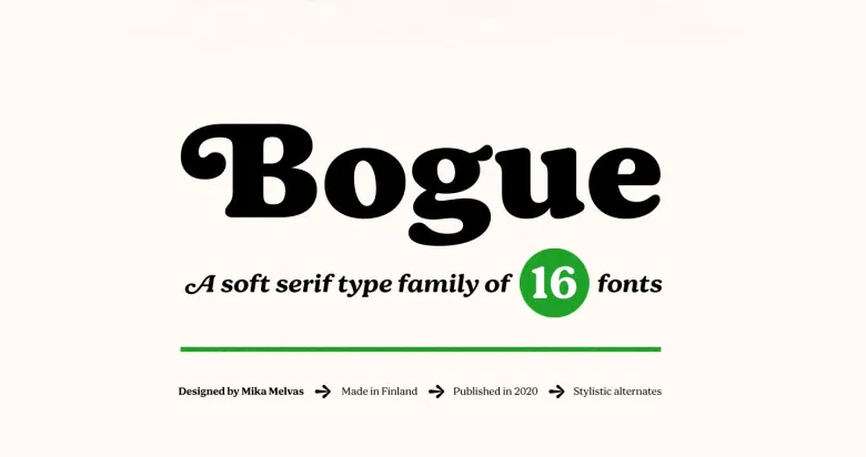

About Bogue Font
I came across Bogue Font while searching for a calm, characterful serif for a book-style branding job. The project needed something classic, but not stiff or boring. I wanted a typeface that could hold long blocks of text, yet still feel warm on the page.
I tested Bogue Font in chapter headings, pull quotes, and simple logo drafts for that client. It sat beside muted colours and soft photography, and it handled the tone well. Later, I prepared more test layouts for Free Fonts Lab, just to see how far I could push it in different settings.
Font Style & Design Analysis
Bogue Font is a serif typeface with a gentle, bookish feel. The strokes are not too sharp, and the contrast stays moderate, which helps it feel approachable. It leans towards a classic editorial style, but without heavy ornament or drama. On the page, it gives off a quiet, confident voice.
The designer is unknown, at least from the material I could find. That sometimes makes it tricky to read the exact design intent, but the font family still feels considered. The spacing, basic weight choices, and overall structure suggest someone with solid understanding of readable typography.
The letterforms have soft curves and tidy serifs that support smooth reading. Lowercase shapes stay open, which helps at smaller sizes. The rhythm between letters is even, though some punctuation feels a bit plain. Its strength sits in text, headings, and calm branding. It is less suited to loud posters or ultra-modern tech visuals, where a sharper serif or a clean sans might work better.
Where Can You Use Bogue Font?
I see Bogue Font working well in editorial layouts, book covers, and long-form reading. At medium to large sizes, the serif details show nicely without becoming fussy. For body text, it stays stable and clear, as long as you give it enough line spacing and avoid very tiny sizes.
For branding, it fits studios, cafés, lifestyle products, and any visual identity that wants warmth with structure. It pairs nicely with a simple sans-serif for menus, captions, or interface text. In my tests, a clean geometric sans beside Bogue Font created a good balance between friendly and organised.
I would not choose it for very young audiences or bold, experimental layouts. The tone is more grown, calm, and literary. Use it where you need trust, comfort, and readability over flash. As a serif option for thoughtful projects, this font style can quietly support the design without stealing the whole stage.
Font License
The licence for Bogue Font can change depending on where you get it. Always check the official source for clear terms on personal, student, and commercial use. Do not assume it is free for client work. When in doubt, confirm usage rights before you send any final files.
After spending time with it in real layouts, I see Bogue Font as a calm, reliable serif I will keep in mind when a project needs quiet strength rather than noise.


Leave a Reply