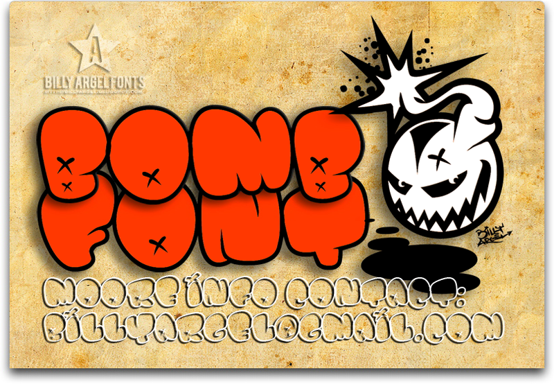
About Bomb Font
I came across Bomb Font while looking for a bold title face for a poster series. I needed something loud but still readable, with strong shapes that could stand next to busy artwork. The name caught my eye first, but the letterforms kept me interested.
I decided to test Bomb Font on a music event layout and a social media banner set for Free Fonts Lab. I wanted to see how this display typeface behaved with colour, texture, and tight grids. It felt like a good chance to check if its heavy style stayed clear on screen and in print.
Font Style & Design Analysis
Bomb Font is a pure display typeface, built to grab attention rather than set long text. The shapes are chunky and compact, with a strong block feeling that pushes forward on the page. It leans into impact more than elegance, which suits loud visual identity work and bold headlines.
The designer is unknown, at least from what I could confirm through common font sources. That uncertainty is common with more experimental display fonts, so I always treat the source with care. I focus on how the font behaves in real layouts, rather than the story around it.
The letterforms in this font family are wide, with tight counters and firm vertical strokes that create a dense rhythm. Spacing feels slightly narrow, so large sizes work best, where each character has room to breathe. Bomb Font carries an aggressive, high-energy mood, great for posters, covers, and gaming graphics, but less suited to calm or minimal brands.
Where Can You Use Bomb Font?
Bomb Font works best when you treat it as a headline specialist. I found it effective on event posters, album covers, and bold hero graphics for websites. At large sizes, the heavy display style creates a strong focal point, especially when you pair it with simple backgrounds and clear supporting typography.
For smaller text, the compact shapes start to lose clarity, especially on low-resolution screens. I would avoid using it for body copy, menus, or long captions. Instead, I pair Bomb Font with a clean sans-serif for information text, so the eye can rest while the display letters carry the main message.
It suits audiences who enjoy loud, dynamic visuals: gaming channels, music events, sports graphics, and streetwear branding. When I used it in a grid-based layout, aligning the blocky letterforms with strong horizontal and vertical lines helped everything feel intentional. Careful line spacing and generous margins keep the design from feeling cramped.
Font License
Before using Bomb Font in any client or commercial project, I would always check the licence details from the original source. Some versions may allow personal use only, while others might permit broader commercial work. Reading the full licence terms is the safest way to avoid legal issues.
For me, Bomb Font is a tool I reach for when I need loud, compact energy and a clear visual punch, as long as the project can handle its strong voice.


Leave a Reply