
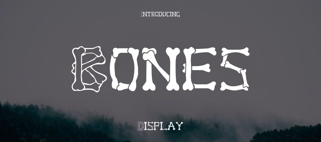

About Bones Font
I first tried Bones Font on a spooky event poster for a local theatre group. They wanted something playful, a bit creepy, but not too serious or gory. The name caught my eye, and the style matched the brief almost perfectly, so I gave this Bones Free Font a proper test.
What pulled me in was the clear theme in every letterform. It looks like bones, but it still stays readable from a distance. I used it in headlines, a logo sketch, and some social graphics to see how it behaved in different layouts for Free Fonts Lab.
Font Style & Design Analysis
Bones Font is a display typeface, and it wears that label proudly. The shapes feel like stacked bones, with clear joints and bends that sell the theme right away. It is bold, high contrast, and designed to grab attention, not to sit quietly in long paragraphs or dense body text.
The designer is designer unknown, but the intention behind the font style feels very focused. Every part of the font family leans into a Halloween, horror, or skeleton mood. It does not try to be neutral or flexible. Instead, it commits to one strong visual idea and explores it fully.
The letterforms have thick strokes, tight inner spaces, and a slightly uneven rhythm that adds character. Kerning is decent for a themed display font, though I still nudge pairs like “AV”, “WA”, and “To” when setting big headlines. The mood sits between fun and eerie, so it works best when you need impact, but it can feel too loud in subtle branding. As a display option, its strength is bold, short text; detailed body copy is not its field.
Where Can You Use Bones Font?
I find Bones Font works best in posters, banners, and large typography where you want instant theme recognition. Think Halloween events, escape room graphics, children’s spooky book covers, or seasonal shop windows. At big sizes, the bone details stay clear, and the character of the typeface really comes through.
At smaller sizes, the joints and inner shapes start to merge, so I avoid it for captions, long copy, or app interfaces. For web use, I keep it for main headings only and pair it with a simple sans-serif or serif body font. That contrast keeps the layout readable while letting this Bones Free Font handle the drama.
For branding, I would use Bones Font as a secondary accent rather than a primary brand font. It suits themed logos, temporary campaigns, or seasonal identities very well. It speaks to audiences who enjoy playful horror, cartoons, or fantasy. When paired with clean typography and enough white space, it can transform a plain layout into something memorable without feeling too tacky.
Font License
The licence for Bones Font can change depending on the source, so I never assume anything. Before using it in client work or commercial projects, I always check the latest licence details from the official distributor. For personal experiments, I still keep a note of terms, just to stay safe and respectful.
My main takeaway as Ayan Farabi: Bones Font is a strong, themed display choice when you need a playful skeleton mood and can give it space to breathe.


Leave a Reply