

About Brandon Grotesque Font
My first reaction to the Brandon Grotesque Font was simple: it felt calm, clean, and friendly. The shapes looked modern, but they also had a soft, human touch. That mix made me curious enough to try it in real client work instead of just staring at sample sheets.
What drew me in most was the balance between geometric order and warm curves. I needed a typeface for a brand that wanted to look serious yet approachable. During testing for a case study I shared on Free Fonts Lab, this font family handled logo sketches, website headers, and short paragraphs without falling apart or feeling stiff.
Font Style & Design Analysis
From a design view, this is a sans-serif geometric grotesque with a clear modern direction. The overall font style feels minimal and elegant, but not cold. Wide counters and clean lines give each letter room to breathe, which helps in both branding and interface work where clarity really matters.
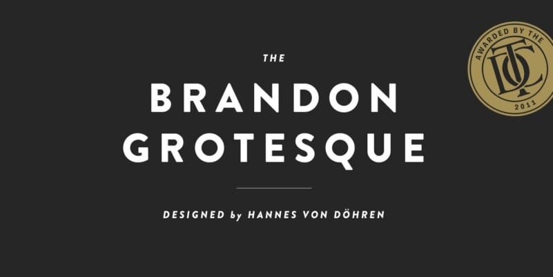
The font comes from designer Hannes von Döhren, known for practical, well-drawn typefaces. His work often aims at everyday design needs, not just showy posters. That intent is clear here. The full font family offers multiple weights, which gave me enough range for visual hierarchy without needing a second typeface.
Looking closer at the letterforms, the rounded corners and smooth curves set the mood. Spacing feels slightly tight at default, so I usually add a bit of tracking for headlines. In text sizes, the rhythm stays steady, though very long paragraphs can feel a touch dense. For me, the strengths lie in titles, logos, and short body copy, rather than heavy editorial layouts.
Where Can You Use Brandon Grotesque Font?
In real projects, I found this font shines in visual identity work. Brand marks, wordmarks, and taglines look clean and balanced, especially at large sizes. The geometric structure keeps things sharp, while the soft details stop it feeling too corporate. It works well for lifestyle, tech, and creative brands that want a modern, friendly tone.
On screens, headings and UI labels set in this typeface stay clear at many sizes. At smaller text sizes, it remains readable, though I avoid extra-light weights for long copy. For websites, pairing a lighter weight for body text with a bolder weight for titles gave me a strong, simple system without visual noise.
Print use tested well too. Posters, brochures, and packaging benefited from the neat curves and tidy spacing. I like pairing the Brandon Grotesque Font with a contrasting serif for long-form reading, which adds texture and keeps the page from feeling too uniform. For youth-focused or design-savvy audiences, the font’s modern geometric feel lands especially well.
Font License
From what I know, this font is a commercial typeface and not a free-open asset. Personal and commercial rights can differ based on the vendor. Before using the Brandon Grotesque Font in any paid client project, always check the official licence terms and purchase a valid licence. My own use followed proper licensing, and that peace of mind is worth it.
My honest takeaway as Ayan Farabi: when a project needs a modern, human sans-serif that feels both structured and warm, this is one of the first options I consider.


Leave a Reply