
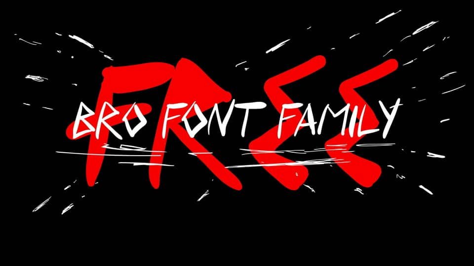

About Bro Font
I came across Bro Font while searching for a loose, human note style for a small packaging job. The client wanted something friendly, but not childish. I downloaded it to see if it could sit beside a clean sans-serif and still feel natural.
My first test was a set of mock labels and a simple social media post. I wanted to know if the handwriting felt honest, or if it looked forced. As I worked with it inside Free Fonts Lab drafts, the font started to show a clear personality that felt casual, but not messy.
Font Style & Design Analysis
This is a handwritten typeface with a relaxed, almost diary-like voice. The strokes look like fast pen writing, with small shakes and pressure changes. It gives the sense of someone writing quickly on a note, but still trying to stay neat. The overall font style feels informal and approachable.
The designer is unknown, at least from what I could trace with normal checks. That lack of clear authorship means I treat it with extra care in client work. When I cannot confirm the source, I keep usage light, mostly for tests or personal experiments, not major brand systems.
The letterforms lean tall, with narrow shapes and short crossbars, which stretches words slightly. Spacing is rather tight, so lines can look busy if you pack too much text. In short phrases, though, the rhythm feels lively and personal. It works well for mood and emotion, but not for dense reading or long paragraphs.
Where Can You Use Bro Font?
I find Bro Font most useful in short, warm messages. Think product tags, journal-style quotes, or casual event graphics. At larger sizes, its handwritten texture becomes clear and charming. On posters or story slides, it adds a human touch that feels like a quick note from a friend.
At small sizes, the thin strokes and tight spacing can be hard to read. I avoid using it for body copy, menus, or detailed instructions. Instead, I use it as an accent against a clean sans-serif or a quiet serif typeface. That contrast keeps the layout readable while still giving character.
This handwritten font family works best for informal audiences: lifestyle brands, DIY projects, personal blogs, or stationery. I would not put it at the core of a serious corporate visual identity. As a secondary display voice, however, Bro Font can bring warmth to headings, callouts, and hand-drawn themed graphics.
Font License
I could not confirm a clear licence for Bro Font, so I treat it cautiously. Before using it in any paid or commercial project, you should check the original source and read the licence terms closely. For personal or experimental work, I still keep records of where and how I obtained the file.
My honest takeaway as Ayan Farabi: I use this font as a light, handwritten accent when I need a human note, but I avoid leaning on it for serious, long-term branding.


Leave a Reply