

About Broken Glass Font
I first tried Broken Glass Font while working on a horror film poster for a small indie project. I needed a loud, sharp title that felt damaged but still readable. This typeface stood out in my test sheet, so I pulled it into the layout and started pushing it in different sizes and colours.
The messy, shattered look gave the poster a strong voice right away. It broke the clean grid in a nice way and added tension without extra graphics. I later wrote this review for Free Fonts Lab because I wanted to see how far I could stretch this font style beyond obvious horror themes.
Font Style & Design Analysis
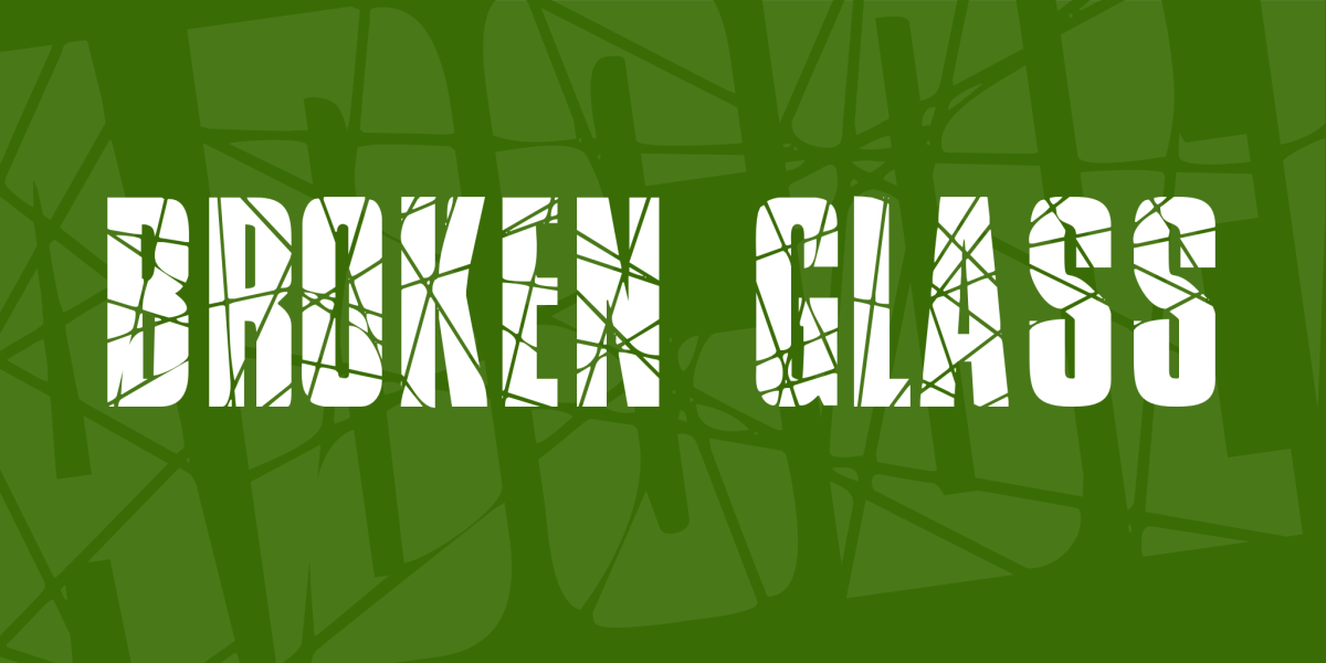
This is a pure display font, built for impact rather than long reading. Each letter looks like cracked glass, with sharp angles and broken edges. The overall font style feels aggressive and dramatic, like a smashed window frozen in time. It instantly pushes the visual identity toward danger, chaos, or suspense.
The designer is unknown, which is common with many themed display fonts floating around design sites. Because of that, documentation is limited, and there is not much background story about the font family. I had to rely on direct testing to judge consistency, character set range, and how stable the letterforms look in real layouts.
The letterforms are bold, jagged, and irregular, with heavy strokes and sharp cuts inside each shape. Spacing is fairly tight, so words form dense, noisy blocks of typography. This suits short titles, but it can feel crowded in long text. The rhythm is chaotic by design, giving strong mood but little subtlety. It works well for horror, thriller, or disaster themes, but it is less useful for calm or minimal branding.
Where Can You Use Broken Glass Font?
Broken Glass Font shines in big, bold settings where you only need a few words. I would use it for movie posters, event flyers, Halloween graphics, or game covers. At large sizes, the cracked details stay clear and add texture, especially when paired with simple background shapes and strong contrast.
At smaller sizes, some fine breaks and inner cuts start to blend together, so legibility drops quickly. I would not recommend it for body text, UI labels, or anything someone needs to read at a glance on a phone. Treat it as a headline-only display font, then support it with a clean sans-serif or serif for paragraphs and captions.
In branding, this typeface works for short-term or seasonal campaigns, not long-term logos, unless the brand lives fully in horror or extreme sports culture. When I pair it, I usually choose a neutral sans-serif with wide spacing to balance the busy letterforms. Careful alignment, simple colour palettes, and generous margins help keep the layout from feeling too loud.
Font License
Broken Glass Font may come with different licence terms depending on where you download it. Some versions allow only personal use, while others might offer commercial rights. I always recommend checking the official source for the latest licence details before using it in client work or paid projects.
My honest take as Ayan Farabi: this font is a powerful display tool when used with restraint, but it needs careful pairing and sizing to avoid visual overload.


Leave a Reply