
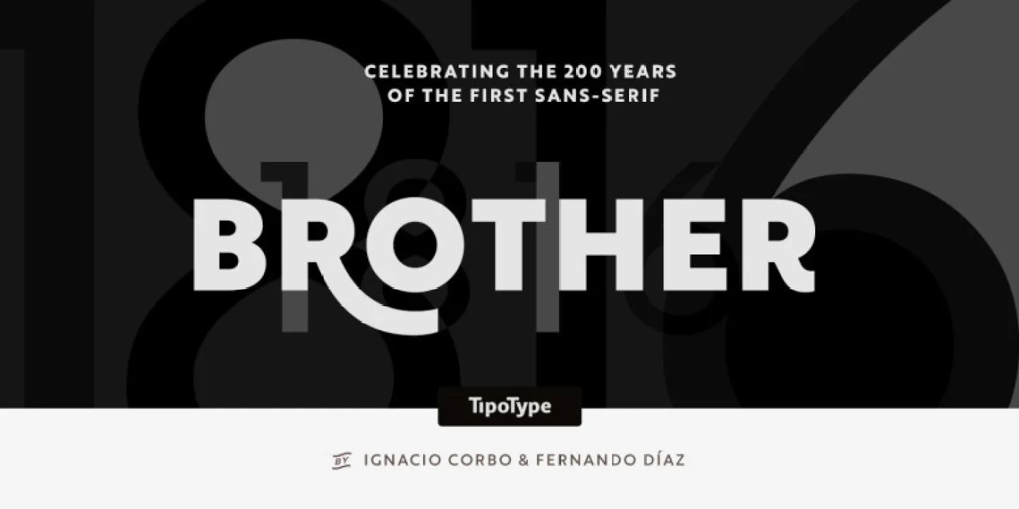

About Brother 1816 Font
The first time I tried the Brother 1816 Font, it felt calm, balanced, and very human. I was looking for a clean sans-serif typeface that could work for branding and simple editorial layouts. The name hinted at a classic influence, and that mix of modern and historic tone caught my eye at once.
I decided to test it on a small visual identity project for a local shop and some layout mockups I was preparing for Free Fonts Lab. I wanted a font family that stayed readable but still had a bit of personality in its letterforms. That real project use helped me see what this typeface does well and where it needs more care.
Font Style & Design Analysis
From my experience, this is a humanist sans-serif typeface with a gentle, friendly voice. The design feels rooted in traditional printing but cleaned up for modern screens. Strokes are not perfectly geometric, so the font style feels warm rather than cold. It sits somewhere between workhorse utility and subtle character, which makes it quite flexible.
The exact creator of this font is not clearly documented, so I have to mark the designer unknown. That does not change how it behaves in design work, but it does mean I stay extra careful with licence checks. When a typeface has unclear origins, I always treat it with more caution, especially for client branding or large campaigns.
Looking closely at the letterforms, I notice open counters, especially in the a, e, and s, which helps legibility at smaller sizes. The spacing feels even, with a steady rhythm that keeps text blocks calm and easy on the eye. Vertical strokes have a slight softness, so the mood never feels too strict. In my tests, the only limitation came when I needed very expressive display typography; it stays polite rather than loud.
Where Can You Use Brother 1816 Font?
When I use the Brother 1816 Font in branding projects, it works best for honest, everyday products and services. It suits small shops, studios, and friendly corporate identities that want a modern yet approachable visual identity. At larger sizes, like headlines or posters, it stays clear, but the tone remains modest instead of dramatic.
In body text, this font style holds up well on both print and screen, as long as the size is not pushed too small. I found it comfortable for short articles, menus, and simple brochures. For long-form reading, I sometimes increase tracking slightly to keep the lines airy. Paired with a clean serif for titles, it creates a nice contrast that still feels unified.
For digital interfaces, I use this typeface for navigation labels, buttons, and simple UI text where clarity is key. It handles medium weights in app layouts quite well, especially on high-resolution screens. When I need a bit more hierarchy, I combine bolder weights for headings with regular weights for body copy, staying within the same font family to keep everything consistent.
Font License
Usage rights for this typeface can vary, so I never assume it is free for every project. Before using the Brother 1816 Font in commercial work, I always check the official licence details from the original source. For personal experiments, I still keep notes, so I know exactly what is allowed. As a designer, that habit has saved me trouble more than once.
After working with this font in real layouts, my honest view is simple: it is a quiet, reliable sans-serif that supports the design instead of competing with it. I reach for it when I want clarity, warmth, and a balanced tone, and I avoid it when a project needs something louder or more dramatic. That balance makes it a steady option in my toolkit as Ayan Farabi.


Leave a Reply