

About Brown Font
I first reached for Brown Font while working on a small journal cover for a local craft shop. The client wanted something friendly, personal, and a bit messy, but still readable. Many script fonts felt too formal, and most playful ones looked too childish for their audience.
That gap is where this typeface caught my eye. Brown Font has a relaxed, handwritten feel that reminded me of quick notes in a sketchbook. I decided to test it properly for Free Fonts Lab, to see if it could handle real layout work, not just pretty mock-ups.
Font Style & Design Analysis
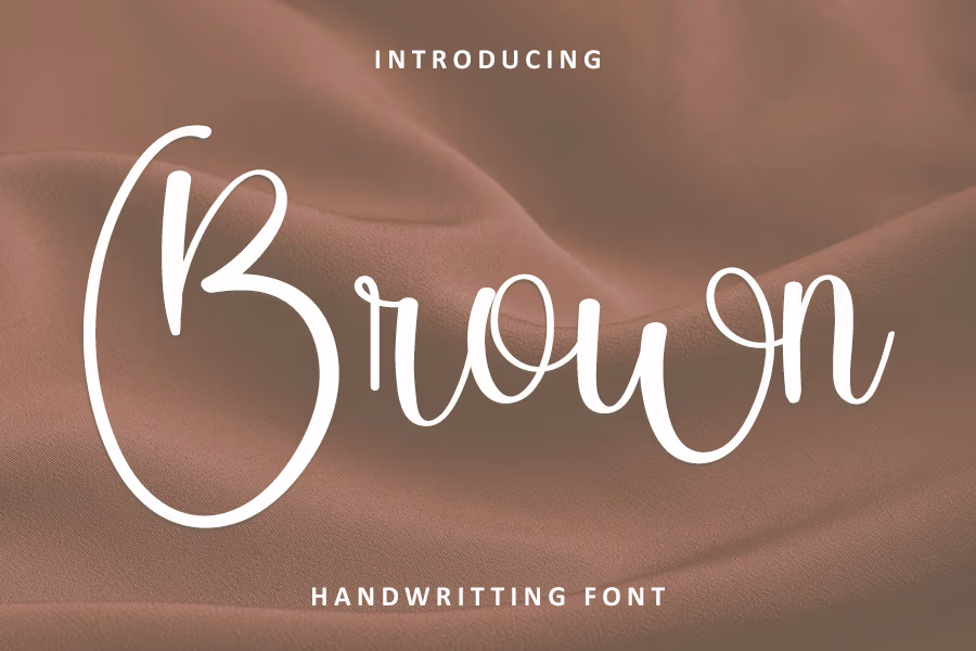
Brown Font is a handwritten typeface with a loose, casual rhythm. The letters feel like they were written with a soft marker or felt-tip pen. Strokes are uneven in a good way, with small shakes and bends that add human warmth. It sits somewhere between neat handwriting and quick doodles.
The designer is unknown, at least from the sources I could check with confidence. That means I read the font purely from its shapes and behaviour, not from any brand story. In a way, that helped me judge it more honestly, based only on how it works on the page.
The letterforms are rounded and slightly wide, which gives Brown Font a friendly, open voice. Spacing is on the loose side, so words can breathe and do not feel cramped. This helps at medium sizes, but at very small sizes the looseness can start to look a bit scattered. The mood is informal and personal, great for notes, quotes, and playful headings. It is less strong for long text or formal branding, where its restless rhythm can feel tiring.
Where Can You Use Brown Font?
In real projects, I find Brown Font works best as a display or accent font, not as a body text workhorse. On the craft journal cover, I used it for the main title and short handwritten-style notes around the layout. At those larger sizes, the small shakes in the strokes really add charm.
For posters, cards, social media graphics, and children’s book headings, this handwritten font gives a warm, approachable tone. It speaks well to young audiences, lifestyle brands, and any project that wants to feel human and relaxed. At big sizes, the character of the letterforms feels deliberate and expressive, not clumsy.
At small sizes, especially under 12pt, the texture of Brown Font can start to blur a little, so I pair it with a clean sans-serif for body text. That pairing keeps the layout tidy while letting the handwritten personality lead in titles and callouts. Used this way, Brown Font becomes a strong voice in a wider font family system, rather than trying to do every job alone.
Font License
The licence terms for Brown Font can change depending on where you get it, and on how you plan to use it. Do not assume it is free for commercial work. Always read the official licence details carefully before using it in client projects or paid products. My takeaway: treat it like any other professional tool and check twice.
As a designer, I see Brown Font as a handy choice when I need honest, handwritten energy without going into chaos. Used with restraint and paired wisely, it can add real warmth and personality to a layout.


Leave a Reply