
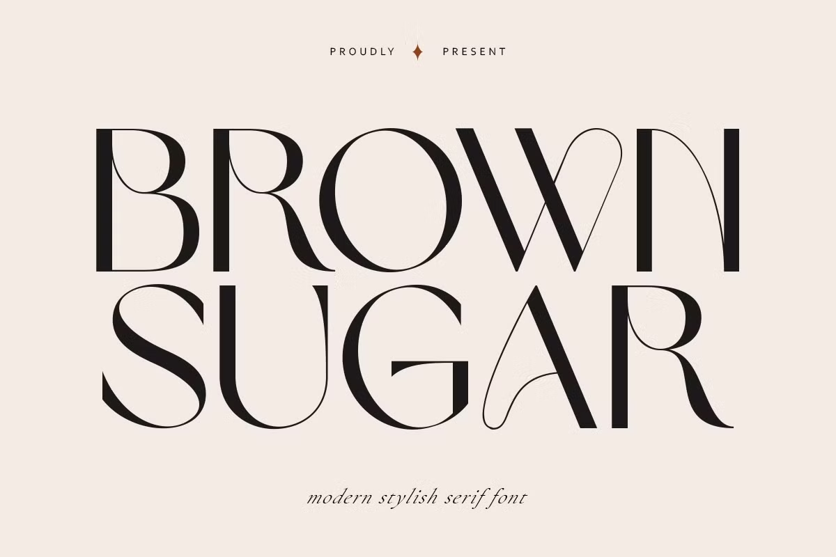

About Brown Sugar Font
I first tried the Brown Sugar Font while working on packaging for a small bakery brand. I wanted something cosy, calm, and a bit nostalgic, but not too decorative or trendy. The name caught my eye, yet it was the balance between softness and structure that made me stop and look closer.
As I tested it across headlines, short copy, and simple logos, the typeface felt steady and friendly at the same time. It gave the products a warm, crafted mood without looking messy. That mix of clarity and charm made me spend more time with it and write this review for Free Fonts Lab, so other designers know what to expect in real projects.
Font Style & Design Analysis
Brown Sugar Font is a serif font, and it leans toward a relaxed, slightly retro style. The serifs are not sharp or strict; they feel rounded and gentle. This creates a soft edge that works well for brands that want warmth instead of cold elegance. The overall font style sits between casual and classic, which is a useful space.
The designer is unknown, at least from the sources I could access while testing it. That said, the font family still shows care in how the shapes connect. The proportions feel thought-out rather than random. It does not look like a quick novelty typeface; it behaves like something built for regular use, with a clear sense of mood.
The letterforms have wide curves, open counters, and a slightly chunky weight that stands out at display sizes. Spacing is generous, so words breathe well, but it can feel loose in long text blocks. The rhythm suits headlines, menus, posters, and short quotes. It brings a cosy, sweet tone, but it is less ideal for dense body copy or very formal corporate layouts.
Where Can You Use Brown Sugar Font?
I see Brown Sugar Font working best in branding for food, lifestyle, crafts, and children’s products. At large sizes, its serif details and curves show nicely and build a strong visual identity. Think bakery logos, coffee shop menus, candle labels, or handmade product tags. It gives those projects a friendly, human touch.
On screens, it performs well for hero headlines, social media graphics, and simple posters. At medium sizes, it stays readable, but I avoid using it for long paragraphs. The wide shapes and relaxed spacing can make big chunks of text feel heavy. For body copy, I usually pair it with a clean sans-serif, letting Brown Sugar Font handle titles and short phrases.
For print work, it shines on invitations, packaging, greeting cards, and magazine section titles. I like combining it with light, airy layouts so the chunky curves do not feel cramped. If a project needs both warmth and clarity, this serif font can be a strong choice. Used with restraint and good pairing, it supports brands that want to feel kind, simple, and approachable.
Font License
Licensing for Brown Sugar Font can change depending on the source, so it is important not to guess. Always check the official licence details before using it for client work, products, or commercial branding. For personal experiments, I still read the terms to stay safe. As a designer, I prefer to respect the creator and keep my projects legally clean. For me, Brown Sugar works best as a character font for warm, human brands rather than a universal choice for every job.


Leave a Reply