
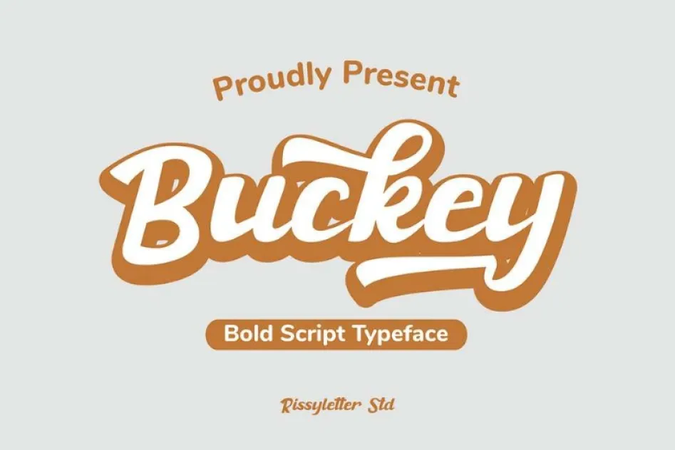

About Bucky Font
I first reached for Bucky Font while working on a small poster for a local craft fair. I wanted something loose, friendly, and a bit playful, but not too messy or childish. Many script options felt either too fancy or too rough, so I started digging deeper.
That search led me to this typeface, and it immediately caught my eye. The curves felt easy-going, and the rhythm looked steady enough for real text, not just a logo. I decided to test it across a few layouts for Free Fonts Lab, from headers to short quotes, to see how it behaved in actual design work.
Font Style & Design Analysis
Bucky Font is a script font, and it leans towards a casual, handwritten look rather than a formal calligraphic style. The strokes are rounded and soft, with a relaxed flow that feels friendly on the page. It gives off a warm, human tone that sits between neat handwriting and quick marker lettering.
The designer is unknown, at least from the sources I could confirm. That lack of clear authorship sometimes happens with script fonts shared on free platforms. Because of that, I always treat information about its origin and development with care and avoid strong claims about its background or history.
The letterforms have simple, open shapes, with a clear baseline and fairly even stroke thickness. Spacing is slightly tight by default, which works well for headings but can start to clump in longer lines. The script connection is mostly smooth, though a few pairs need manual kerning in careful layouts. It shines in short phrases, but loses clarity when pushed into dense paragraphs.
Where Can You Use Bucky Font?
I find Bucky Font most comfortable in display roles where personality matters more than strict readability. It works well for posters, greeting cards, and social media graphics, especially for brands that want a friendly, handmade tone. At large sizes, the strokes feel confident and the script character becomes a strong part of the visual identity.
At medium sizes, like subheadings or short pull quotes, the font style still holds up, but spacing needs more attention. I often loosen the tracking slightly and adjust line height to avoid crowding. For long text blocks, I avoid this script and pair it with a clean sans-serif or serif typeface, letting Bucky Font handle only key words or short lines.
On smaller screens, such as mobile stories or profile banners, this script font can stay readable if you keep the text short and the contrast high. I would use it for casual food brands, craft shops, or event posters aimed at younger audiences. It also pairs nicely with simple geometric shapes and flat colours, which keep the layout balanced and avoid visual noise.
Font License
The licence terms for Bucky Font can vary depending on where you download it. I never assume it is free for commercial use, even if a site suggests that. Before using it in paid client work or products, always check the latest licence details on the original source and keep a record.
My honest takeaway as Ayan Farabi: I reach for this script when I need an easy-going, human touch in short, bold phrases, but I keep it away from long reading text or highly formal projects.


Leave a Reply