

About Buinton Font
I came across Buinton Font while working on a vintage-themed wedding invite set. I needed a flowing script that felt soft, but still readable in print. Many options looked either too formal or too messy, so I kept searching until this one stood out.
The gentle curves and clear connections caught my eye first. It had that hand-drawn charm without feeling childish. I tested it on mock-ups and shared them with the couple. Their reaction was calm and positive, which gave me the push to explore it deeper for Free Fonts Lab.
Font Style & Design Analysis
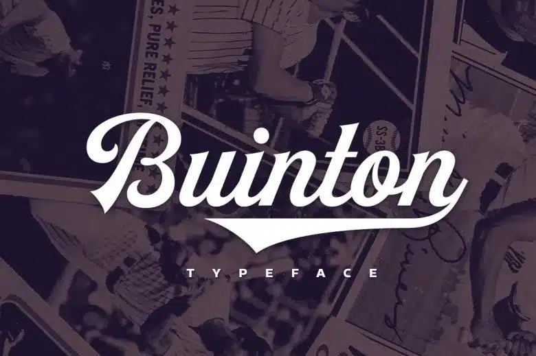
Buinton Font is a classic script typeface with a clear calligraphic touch. The strokes feel like ink from a pointed pen, but the shapes stay neat and controlled. It leans towards an elegant, vintage mood, with long tails and smooth curves that give each word a graceful flow across the line.
The exact creator of this font is designer unknown, which makes detailed background research a bit tricky. Still, the craft behind the font family feels careful and deliberate. The letterforms show a strong understanding of traditional calligraphy, especially in the way the thick and thin strokes balance each other.
The lowercase letters have generous loops, while the capitals take up space with proud, sweeping forms. Spacing is fairly tight, as you would expect from a script style, but not so tight that letters crash into each other. The rhythm feels smooth in short words and names, though long sentences can start to look busy. It shines when used for key phrases, but it is less suited to long blocks of text.
Where Can You Use Buinton Font?
I find Buinton Font works best in branding that needs romance, nostalgia, or a crafted touch. Wedding stationery, boutique logos, beauty packaging, and café menus are all strong fits. At large sizes, the curves and swashes feel expressive and confident, which helps give a logo or headline real personality.
In smaller sizes, the fine details can begin to close up, especially on screens with lower resolution. For body text or long paragraphs, I would switch to a clean serif or sans-serif and keep this script for titles only. Paired with a simple, neutral typeface, it supports a clear visual hierarchy and keeps the layout easy to scan.
For social media graphics, quotes, and invitations, the font style adds an emotional layer without shouting. It suits audiences who enjoy classic, romantic typography rather than bold, trendy looks. When I pair it with muted colours and generous spacing, it helps build a calm, mature visual identity that still feels warm and personal.
Font License
Licensing for Buinton Font can change depending on the source, so I never assume it is free for all uses. I always check the official documentation before using it in paid client work or branding. For any commercial project, please review the current licence terms carefully and follow the creator’s rules.
For me, Buinton Font is a font I reach for when I want gentle elegance without losing legibility, as long as I use it with care and restraint.


Leave a Reply