

About Burgues Font
I first reached for Burgues Font while working on a wedding invitation set that needed very formal lettering. The couple wanted something romantic, but not childish or messy. I remembered seeing this script in a past project archive and decided to give it a proper test on real print layouts.
What drew me in was its rich, flowing contrast and the feeling of classic pen work. On screen, the swashes looked bold yet controlled, which is rare. I tested it across headings, monograms, and name lines. For Free Fonts Lab, I also explored how flexible it feels for everyday designers, not just high-end calligraphy work.
Font Style & Design Analysis
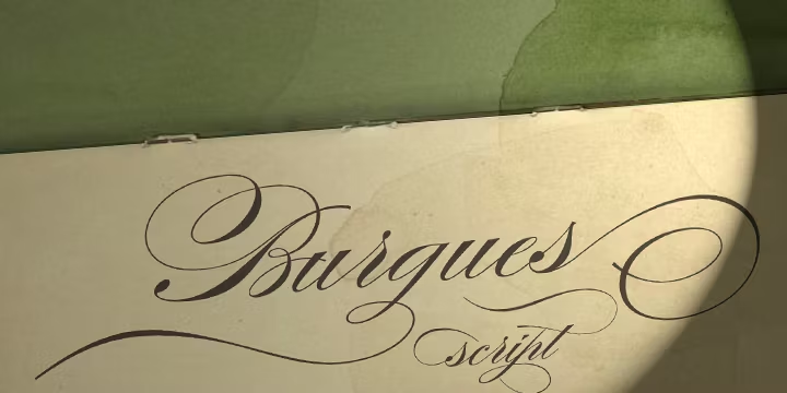
Burgues Font is a classic script typeface with a strong calligraphic voice. The strokes echo pointed pen work, with elegant loops and high contrast between thick and thin lines. It leans heavily into formality, so the visual direction feels historic, refined, and almost ceremonial rather than casual or playful.
The original design is most often linked to historical copperplate and ornamental penmanship traditions, though the exact digital designer is sometimes credited differently across sources, so I would treat the digital author as designer unknown. What matters in use is how carefully the curves have been translated into a modern font family suitable for detailed typography work.
The letterforms in Burgues Font show strong rhythm, with tall ascenders and generous loops that create a rolling texture. Spacing is tight by default, which helps maintain script flow but can cause collisions in certain letter pairs. It shines in short words and names, where the swashes can breathe. Long text lines quickly become heavy and hard to read, so I avoid it for paragraphs.
Where Can You Use Burgues Font?
Burgues Font works best in projects that need ceremony and elegance. I like it for wedding suites, certificates, luxury packaging, and formal event branding. At large sizes, the script details feel sharp and impressive, especially on print materials like thick paper, foil stamping, or letterpress-inspired mockups.
On screens, the script style holds up well in headings and logos, but only when used big enough. Small sizes quickly lose the fine contrast, which hurts readability. For user interfaces or long digital reading, I always pair it with a calm serif or sans-serif body typeface and keep Burgues only for hero words, signatures, or initials.
For audience fit, it speaks to luxury, romance, and tradition. I would not use it for tech brands, minimal layouts, or youth-focused campaigns. When pairing, I usually choose a very simple geometric or classic serif, and keep spacing roomy around the script so it does not fight other elements. In tight grids or busy layouts, the swashes can feel trapped.
Font License
The licence terms for Burgues Font can vary between sources, so I never assume it is free for all uses. Always check the official provider for clear details on personal and commercial rights, web embedding, and print use. When in doubt, I treat it as licensed and plan budget and approvals accordingly.
My personal takeaway as Ayan Farabi: I reach for Burgues when a project truly needs ornate, formal script energy, and I keep its use focused, intentional, and well-spaced.


Leave a Reply