
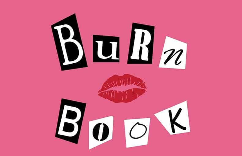

About Burn Book Font
I tested the Burn Book Font while working on a playful teen drama poster. I needed something loud, messy, and a bit rebellious, but still readable in a busy layout. The name caught my eye first, but the chaotic cut-out look is what made me stop and explore it more.
As I played with it in mock-ups for Free Fonts Lab, I saw that this typeface leans strongly into attitude and mood. It is not a quiet choice at all. I used it mainly for headlines and a rough logo concept, because the energy of the letters suited a bold, youth-focused visual identity.
Font Style & Design Analysis
This is a pure logo font at heart, designed to grab attention first and ask questions later. The style echoes ransom-note collage lettering, with shapes that feel cut from magazines or stickers. Each character looks slightly irregular, which adds tension and drama. It instantly suggests gossip, secrets, and high-school style chaos.
The designer is unknown, at least from every source I could trace while testing this font family. That uncertainty fits the rough, underground feel of the typeface. It looks like something you might see in a DIY zine or on a bedroom wall poster, made with scissors, glue, and teenage energy rather than careful studio work.
The letterforms mix sharp angles and rounded edges, so the rhythm feels jumpy but still controlled enough for short words. Spacing is intentionally uneven, which adds to the handmade look but hurts long text use. Strengths sit in one or two-word marks, titles, and graphic phrases. Limitations appear when you try neat alignment or polished corporate typography.
Where Can You Use Burn Book Font?
I see the Burn Book Font working best in bold, youth-driven branding, especially as a logo or main headline. At large sizes, the texture and cut-out feel really come alive, and each letter adds character to the page. It suits posters, covers, and social graphics where drama and attitude matter more than refinement.
In small sizes, the rough edges and mixed shapes start to blur, so I avoid it for body copy or long taglines. I usually pair it with a calm sans-serif or simple serif font style, which holds the layout together and keeps the wild headline in check. This balance helps the typography feel edgy but still readable.
It fits teen films, gossip-themed projects, nostalgia designs, and any visual identity that leans into chaos, secrets, or school-life storytelling. If a client wants a clean corporate image, I keep this typeface out of the options. But for mood boards, title cards, or limited-use logos, it can be the exact note of mischief you need.
Font License
The licensing for the Burn Book Font can vary depending on the source, and some versions may not be cleared for commercial logo use. I always double-check the official licence terms before using it in paid client work. For any serious branding project, confirm usage rights directly from the original provider.
My main takeaway as a designer: this font is a strong spice, not a base ingredient. When I used it carefully and kept its role small but loud, it added real personality without wrecking readability or structure.


Leave a Reply