
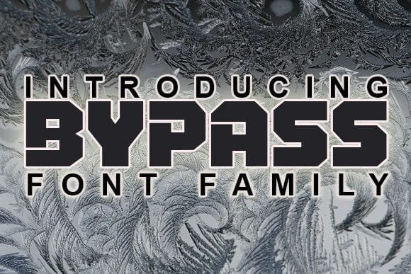

About Bypass Font
I came across Bypass Font while searching for a bold headline style for a poster series. The thumbnails showed strong, sharp shapes that felt modern but not cold. That contrast caught my eye right away, so I downloaded it and started testing it in a few layout drafts for Free Fonts Lab.
What pulled me in was the clear, punchy energy of the font family. It looked like a typeface made to grab attention, not sit quietly in the background. I wanted to see how it behaved in real compositions, especially in tight grids and busy layouts where many display fonts quickly fall apart.
Font Style & Design Analysis
Bypass Font is a display typeface built for impact. The overall font style feels geometric and deliberate, with confident angles and clean, controlled curves. On screen, the shapes read as firm and structured, so each word looks like a solid block of design rather than a loose collection of letters.
The designer information is not clearly stated anywhere I checked, so I will mark it as designer unknown. That said, the construction suggests a careful eye. The letterforms show consistent logic from character to character, which is something I always notice when I test new display fonts in real layouts.
The letterforms are quite wide, with tight inner counters and compact spacing. This creates a dense rhythm that works best in short words or short phrases. The mood leans bold, urban, and slightly techy. It shines in big, centred headlines, but it starts to feel heavy in longer lines of text. Thin details are limited, so it stays strong at large sizes but can look cramped if you shrink it too far.
Where Can You Use Bypass Font?
I see Bypass Font working best in posters, banners, and cover images where you only need a few words. At big sizes, the display structure feels stable and powerful. In my tests on music event posters, the font held its shape even when I pushed tight tracking and strong colour contrast.
For branding, it can support bold visual identity work, especially for tech, gaming, or streetwear projects. I would not use it as a main logotype for very formal brands, but it can play a strong role in campaign headlines or seasonal graphics. Paired with a clean sans-serif for body copy, it creates a clear hierarchy and a sharp, modern tone.
In digital layouts like hero sections, app splash screens, or social graphics, this display font works well when you keep the copy short. It loses clarity in very small sizes, so I would avoid using it for buttons or captions. In my layouts, I often paired it with generous line spacing and plenty of margin, which helped the heavy letterforms breathe and stay readable.
Font License
The licence for Bypass Font may differ between personal and commercial use, so it is important to check the official source before using it in client work. I always recommend reading the latest licence text carefully, especially if you plan to use the typeface in logos, products, or large campaigns.
For me, Bypass Font is a tool I reach for when I need strong, compact headlines with a clear voice. It is not a flexible all-rounder, but used with care, it can give a layout that firm, attention-grabbing edge that many projects need.


Leave a Reply