
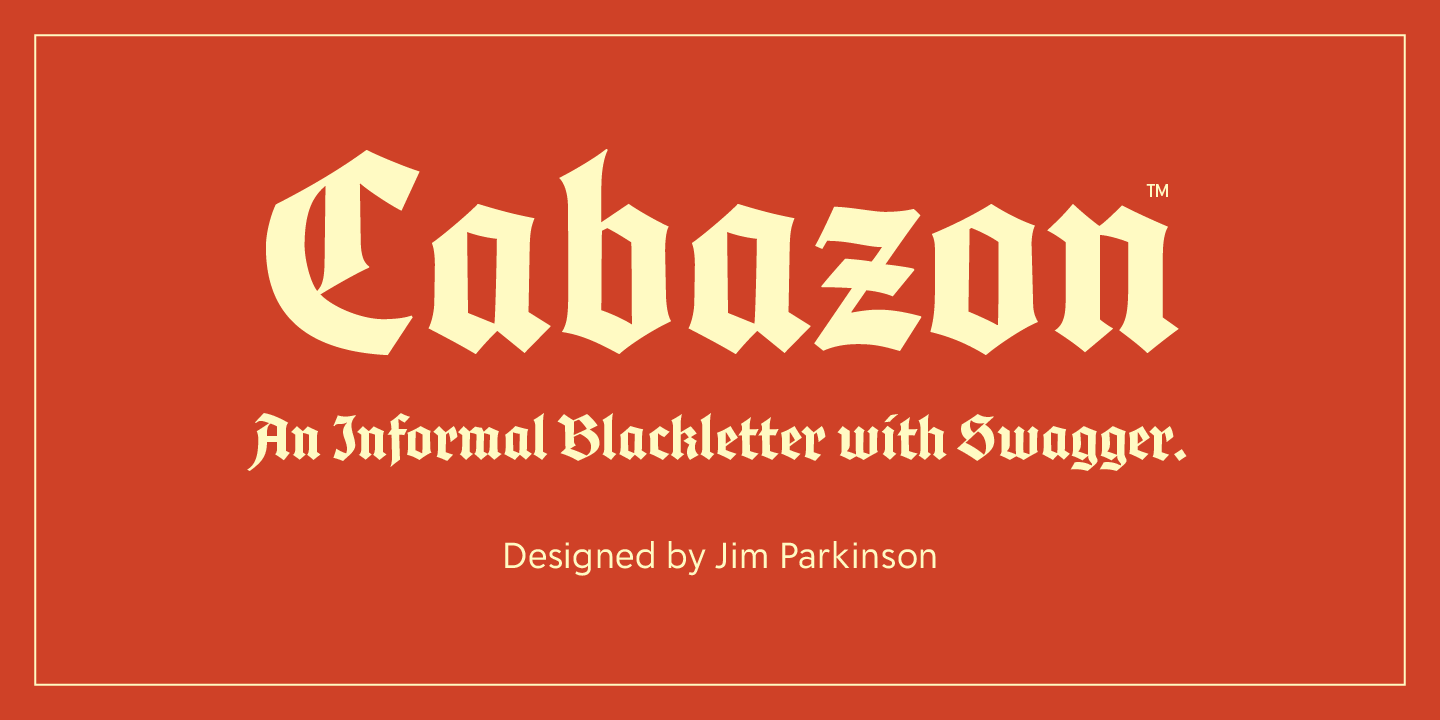

About Cabazon Font
I came across the Cabazon Font while working on a poster that needed a bold, historic mood. I wanted something sharp and dramatic, but not messy or hard to read. The name caught my eye first, then the heavy strokes and pointed forms pulled me in.
I decided to test it for a series of music event graphics we were exploring at Free Fonts Lab. I was curious how this typeface would behave in real layouts, with photos, logos, and short headlines. It felt like a good chance to see if its strong style could stay readable and balanced.
Font Style & Design Analysis
The Cabazon Font is a pure blackletter design with a sharp, gothic voice. The overall look feels strong, dark, and ceremonial, with tall, narrow shapes and tight inner spaces. It sits somewhere between old medieval scripts and modern metal band logos, so the mood is intense but still controlled.
The designer is unknown, at least from what I could confirm during my testing. That said, the work shows a clear understanding of traditional blackletter structure. The strokes follow classic calligraphic angles, yet the font family leans more towards display use than strict historic revival. It feels made for posters, not for book pages.
The letterforms have heavy vertical stems, sharp spurs, and dramatic diagonals. Spacing is quite tight, which boosts impact in big titles but can make long words feel dense. The rhythm is spiky and rhythmic, giving a powerful texture when you stack lines. It shines in short headlines, logos, and wordmarks, but it struggles in body text or small captions. As a blackletter display choice, its biggest strength is mood, not versatility.
Where Can You Use Cabazon Font?
I see the Cabazon Font working best in projects that need a dark, bold visual identity. Concert posters, metal or punk band artwork, tattoo studio branding, or horror-themed graphics fit it well. When set large, the letterforms feel dramatic and clear, so big headlines and logotypes are its natural home.
At medium sizes, like subheadings or navigation text, it can still work if you give it space and strong contrast. I would avoid using it for long paragraphs, menus, or small labels, because the tight spacing and complex shapes reduce legibility. It is very much a display typeface, meant to be seen more than read for long periods.
For pairings, I had good results combining this blackletter font style with a clean sans-serif. A simple geometric or humanist sans keeps the layout calm and readable while Cabazon handles the drama. Use it as the main accent in titles, then rely on a neutral companion for body copy, notes, and supporting text.
Font License
Licensing for the Cabazon Font can vary, so I never assume it is free for every use. Before using it in client work or paid projects, please check the official source for current licence terms. Make sure personal, commercial, desktop, and web rights match your needs.
My honest takeaway: Cabazon is a strong, stylised tool that works best in small doses. When used with care and contrast, it can give a project a striking, memorable edge.


Leave a Reply