
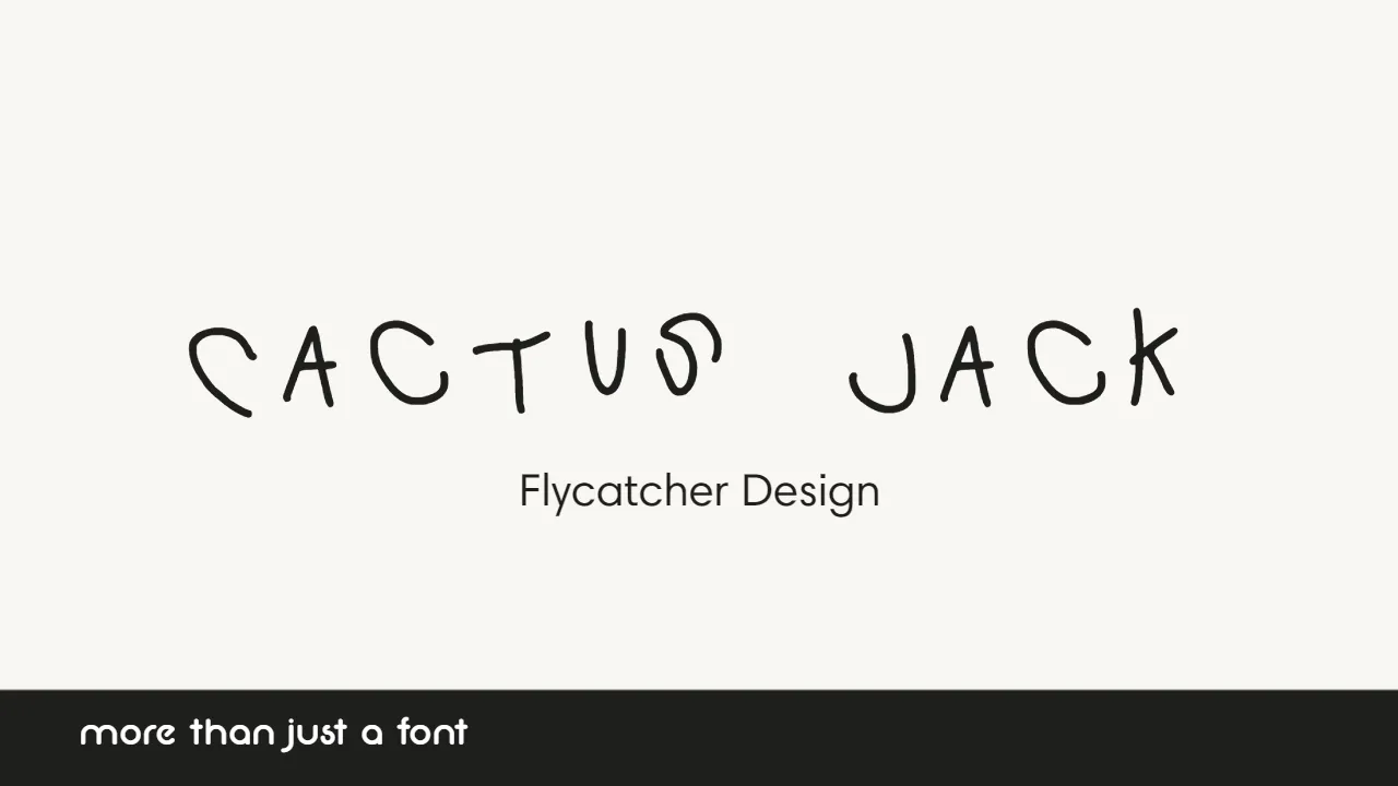

About Cactus Jack Font
My first reaction to the Cactus Jack Font was simple: this thing feels loud and raw. I reached for it when I was working on a gritty poster concept that needed a rough, hand-drawn edge. The name caught my eye first, but the jagged shapes sealed the deal for me.
What pushed me to test it more was its strong display energy. I wanted to see if this font could carry a full visual identity, not just a single title. For a review on Free Fonts Lab, I tried it across mockups, from posters to cover art, to understand where it shines and where it starts to struggle.
Font Style & Design Analysis
From my own use, I see Cactus Jack Font as a bold display typeface with a rough, poster-style attitude. It feels hand-drawn and slightly chaotic, almost like quick marker strokes on a wall. This kind of font family is not meant for calm branding; it pushes your layout toward noise, movement, and raw emotion.
As far as I can tell, the designer is unknown, which fits the wild, underground look it gives off. It reminds me of street-inspired typography used in music graphics and pop culture merch. That sense of mystery can work well when you want the font style itself to feel unpolished and less corporate.
Looking closely at the letterforms, I noticed sharp angles, broken curves, and uneven strokes that create a jumpy rhythm. Spacing feels tight in many pairs, so I often adjust tracking to give it more air. The mood is tense and energetic, which works great in short words and bold headlines, but it quickly becomes tiring and messy in long text lines or small captions.
Where Can You Use Cactus Jack Font?
In my projects, Cactus Jack Font worked best on large, bold titles, especially for posters, album covers, and social media graphics. When you blow it up, those rough edges and display details read clearly and give the design a strong punch. It speaks well to younger, trend-aware audiences who enjoy loud, edgy visuals.
At medium sizes, such as subheadings or button labels, it becomes harder to balance. I usually keep it only for the loudest words and then pair it with a clean sans-serif or simple serif typeface for body copy. That contrast lets the wild shapes sit on top of a calm base, so the whole composition feels intentional, not chaotic.
In small sizes, the font loses clarity fast, and the more distressed parts start to blur visually. For packaging, stickers, or badges, I would only use very short names or initials with lots of white space around them. When I build layouts, I treat this font as a headline tool, never as a workhorse, and I always test it on real screens and prints before locking in a design.
Font License
From what I could find, licence terms for Cactus Jack Font are not fully clear, and they may vary by source. If you plan to use it in any commercial project, please check the official licence details carefully and make sure the permissions match your client’s needs. That habit has saved me more than once.
My honest takeaway as Ayan Farabi is that this font is powerful when used with restraint. It can give a project bold personality, but only if you keep it for key moments and support it with calmer typography choices.


Leave a Reply