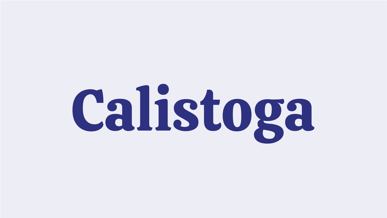
About Calistoga Font
I first tried the Calistoga Font while working on a vintage-style food packaging mockup. I needed a typeface that felt friendly and bold, but not childish or messy. When I saw its chunky curves and relaxed energy, I felt it might hit that sweet spot between playful and confident.
I tested it on headlines, product names, and small callouts inside the layout. It stood out without shouting. The wide shapes gave the design a cosy, handmade mood, which worked nicely for the concept. Later, I wrote this review for Free Fonts Lab, because I felt other designers might face the same kind of brief.
Font Style & Design Analysis
The Calistoga Font is a serif typeface with a strong display character. Its thick strokes, soft curves, and large forms make it feel warm and welcoming. The serifs are chunky and rounded, so nothing looks sharp or stiff. It has a relaxed, almost nostalgic tone that still feels clear and readable at larger sizes.
The designer is listed as Sorkin Type, a foundry known for practical yet expressive type. You can feel that mindset here. The font family keeps things simple, focusing on one main style rather than a huge range of weights. That choice suits its purpose as a display serif for short, punchy text.
The letterforms have generous counters and a wide stance, which helps legibility in headlines and logos. Spacing is open, so words breathe nicely, but it can look too loose in long paragraphs. The rhythm feels steady, almost bouncy, which adds charm. It shines in big titles, labels, and branding, but it is not built for dense body copy or strict corporate layouts.
Where Can You Use Calistoga Font?
I see the Calistoga Font working best in branding for food, cafés, small shops, and lifestyle products. At large sizes, its serif details and bold shapes feel inviting and personal. It carries a friendly, handcrafted mood that fits packaging, menus, poster headlines, and event graphics where warmth matters more than formality.
On screens, it holds up well for hero text, banners, and social media graphics. The heavy weight grabs attention, while the soft curves keep it approachable. At smaller sizes, though, the thick strokes and tight internal shapes can start to blur, especially on low-resolution displays. I avoid using it for long paragraphs or tiny UI labels.
For pairings, I usually combine this serif display face with a clean sans-serif for body text, something neutral and light in contrast. A simple geometric or humanist sans works nicely under its bold presence. In layouts, I let Calistoga handle the main headlines or key phrases, then keep supporting text calm and modest, so the eye knows exactly where to look.
Font License
Before using the Calistoga Font in any client or commercial project, you should always check the current licence on the official source. Terms for personal and commercial use can change over time, and I never assume they stay the same. Taking a minute to confirm rights can save real trouble later.
For me, Calistoga has become a reliable choice when I want a bold serif that feels kind, not aggressive. I reach for it when a project needs personality, comfort, and a touch of retro charm without losing clarity.


Leave a Reply