
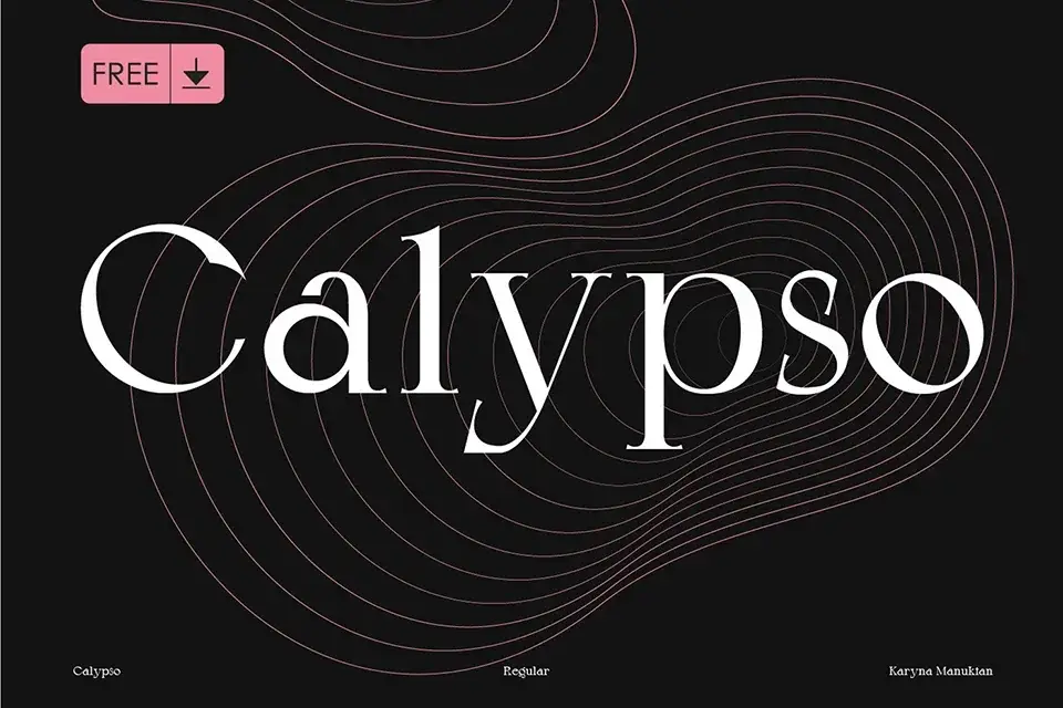

About Calypso Font
I first tried Calypso Font while working on a book cover that needed something quiet but confident. The layout was simple, yet the title had to feel considered and grown-up. I wanted a serif that did not shout, but still carried presence on the page.
As I tested options for that project, this typeface stood out because of its calm, balanced look. The proportions felt steady, and the rhythm between letters made long words easy to read. I later wrote about the experience for Free Fonts Lab, after using it in a few more editorial mock-ups.
Font Style & Design Analysis
Calypso Font is a serif typeface, and it leans into that category with a classic, bookish feel. The serifs are well-shaped and consistent, giving the font family a clean, structured voice. It does not feel stiff, though. There is a soft warmth in the curves that keeps the typography approachable and human.
The exact creator of this font is not clearly documented, so for now I have to treat the designer as unknown. That said, the drawing quality suggests someone with a solid eye for editorial work. The weight distribution and contrast are controlled, which makes the font style feel thought-through rather than experimental.
Looking more closely at the letterforms, the lowercase has a nice even colour when set in paragraphs. Spacing feels measured, with no strange gaps between common pairs. The capitals are slightly more formal, which helps in titles and pull quotes. It works well for calm, serious moods, but it is less suited to loud, playful layouts or highly expressive branding.
Where Can You Use Calypso Font?
In my tests, Calypso Font performed best in editorial and reading-focused projects. Book covers, chapter headings, essays, and long-form articles all benefited from its stable serif structure. At medium sizes, it gives a strong, literary tone without feeling old-fashioned. It works especially well when you want trust and clarity in the visual identity.
At larger sizes, like posters or hero headlines, the fine details of the serif shapes start to stand out. The contrast is not extreme, so it holds up on screens and prints. For pairings, I liked using a clean sans-serif for captions or navigation, while letting this serif handle body copy and subheads. That balance kept layouts tidy but still characterful.
At smaller sizes, the font remains readable if you give it enough line spacing and do not crush the text too tightly. I would use it for body text on print pieces, or short paragraphs on the web, but not for dense UI text. It suits audiences who appreciate calm, structured design: publishers, cultural institutions, or thoughtful personal brands.
Font License
The licence terms for Calypso Font can vary depending on where you get it, and they may change over time. I always recommend checking the official source carefully before using it in any personal or commercial work. Make sure the allowed usage fits your project, especially for client or large-scale branding jobs.
For me, this font has become a quiet option I reach for when a project needs a steady serif voice without drama.


Leave a Reply