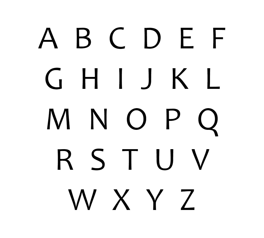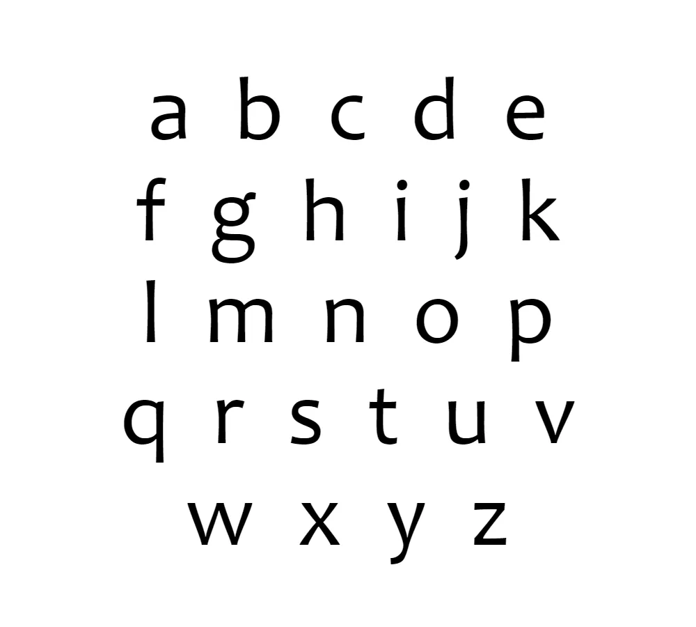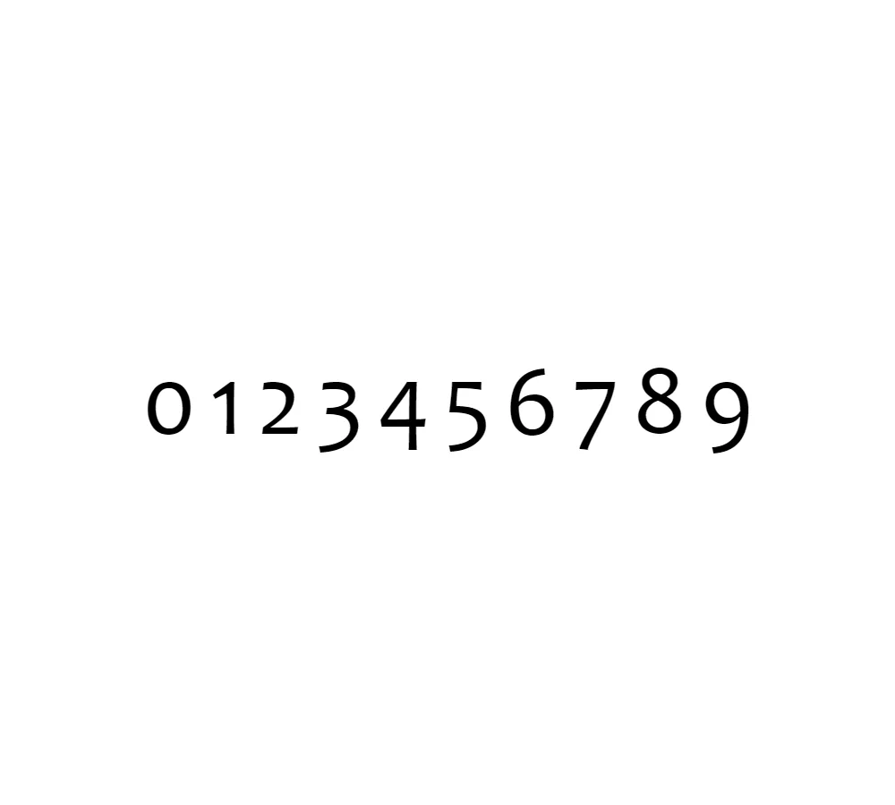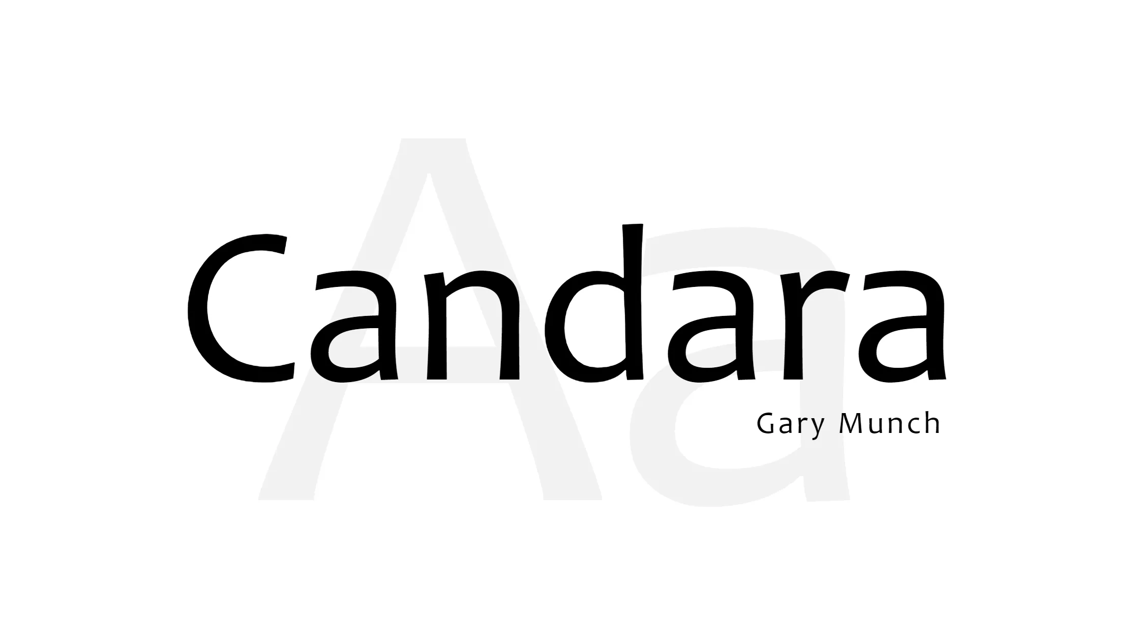


Candara is one of my favorite fonts. This humanist sans-serif typeface was made by Gary Munch for Microsoft. It is a true work of art. I love how professional and up-to-date it looks while still having a friendly, warm feel.
Candara is different from other fonts because it has a unique look. It looks lively and interesting because its verticals have both entasis and ekstasis on opposite sides of the stems. There are also high-branching arcades on the lowercase letters, which add a touch of elegance and sophistication. Also, all open forms in Candara have big holes, which makes it easy to read even when it’s small.
The way Candara is written in italics is one of the things I like best about it. It’s clear that the designer was influenced by serif and calligraphic fonts, both of which are common in modern sans-serif typefaces. This makes Candara more artistic and gives it a more personal feel, as if it were written by hand.
Candara is part of the Clear Type Font Collection, which is a group of fonts that were made to work well with Microsoft’s Clear Type text rendering system. Candara was released with Windows Vista, along with Calibri, Cambria, Consolas, Corbel, and Constantia. Since then, it has become a popular choice for both designers and writers.
Candara is a great choice if you’re looking for a font that is both elegant and up-to-date. It stands out from the rest because of its unique design, like the ogee curves on diagonals. Plus, it has a warm, friendly feel that makes it great for both business presentations and personal projects.
In the end, Candara is a font that is both nice to look at and very useful. Candara is a font that will get the job done while still having a human touch. You can use it to write a blog post, make a website, or make a business card. So, if you want a font that is both professional and up-to-date, try Candara the next time you need one.


