

About Cartonsix Font
I came across Cartonsix Font while looking for a bold, playful title face for a poster series. I needed something loud, chunky, and a bit quirky, but not messy or hard to read. The name caught my eye first, then the shapes kept me there.
I decided to test it for a mock packaging concept I was building for Free Fonts Lab. I wanted to see if this font could hold a full brand story on its own. It felt like the kind of typeface that could shout without screaming, so I gave it a proper trial across several layouts.
Font Style & Design Analysis
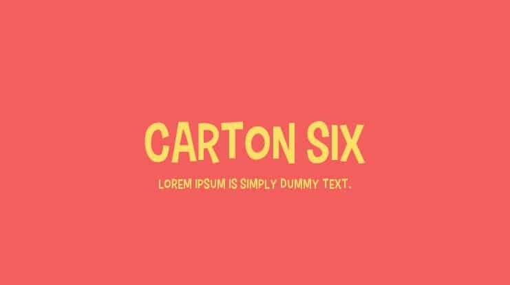
Cartonsix Font is a pure display typeface, and it leans hard into that role. The letters are big, blocky, and confident, with strong shapes that demand space. It feels built for posters, packaging, and loud headings rather than quiet body text. The overall look is bold but friendly rather than aggressive.
The designer is not clearly credited in any source I checked, so I have to treat it as designer unknown. That means there is no official story about its design goals or history. In practice, I judged it only by how it behaves in real projects, not by reputation or hype.
The letterforms have thick strokes, tight curves, and quite compact counters. Spacing is on the tighter side, which helps when you set big titles but can crowd letters at smaller sizes. The rhythm feels punchy and energetic, which suits a display font family used for short words or strong slogans. It works best when you give it air, strong colour contrast, and simple supporting typography. For dense paragraphs or tiny captions, it quickly loses clarity.
Where Can You Use Cartonsix Font?
I see Cartonsix Font working well in bold branding for youth-focused products, snacks, toys, streetwear, or events. It carries a playful, almost cartoon-like mood that feels informal and approachable. On posters, banners, or social media graphics, it stands out fast, especially when used in just a few strong words.
At large sizes, the chunky letterforms look solid and confident, and the edges read clearly. For medium sizes, like subheads or short taglines, it still holds up, but you need enough line spacing. At small sizes, the tight spacing and heavy shapes start to blend, so it is not suited for long copy or UI labels.
In terms of pairing, I had good results setting Cartonsix Font for main headings and using a clean sans-serif for body text. A simple, neutral typeface helps balance its loud personality and keeps the layout readable. I would avoid pairing it with another strong display style, as that can create visual noise and weaken the hierarchy.
Font License
The licensing for Cartonsix Font can vary between sources, so I would not assume it is free for every use. Before using it in client work, branding, or commercial products, always read the licence details on the original download page. When in doubt, contact the owner or choose a clearly licensed alternative.
After testing it in a few layouts, I see Cartonsix Font as a fun, focused tool: great for bold headlines when you respect its limits and give it space to breathe.


Leave a Reply