
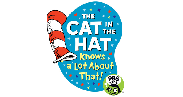

About Cat In The Hat Font
I first tried the Cat In The Hat Font while working on a playful logo for a children’s reading club. I needed something loud, quirky, and a bit nostalgic, but still clear enough to read at a glance. This font caught my eye because it echoed that classic storybook chaos without feeling cheap or forced.
I tested it across a few mock posters and a simple social media set for Free Fonts Lab. The heavy, uneven shapes gave the layouts a bold voice very quickly. I kept using it because it solved a common problem for kids’ branding: how to look fun and energetic, yet still stay readable and structured.
Font Style & Design Analysis
This typeface works mainly as a logo display font, built for big, attention-grabbing words rather than long text. The font style leans into exaggerated curves, tall forms, and a slightly chaotic rhythm, which matches the playful, storybook mood. It feels like it was drawn to be loud first, then refined just enough for real design work.
The original creator is designer unknown, which is important to keep in mind if you care deeply about authorship. Even so, the typeface carries a clear visual identity that suggests hand-drawn inspiration. It sits in that space between cartoon lettering and bold poster typography, which can be powerful when used with care.
The letterforms have chunky strokes, uneven baselines, and varied widths that create a bouncy rhythm across a word. Spacing is tight by default, so I often add a little tracking when setting short headlines. The mood is playful and slightly chaotic, which is a strength for titles and logos but a limitation for body copy or subtle branding. As a logo font family, it shines when you use only a few words and give it room to breathe.
Where Can You Use Cat In The Hat Font?
In my projects, this typeface works best in loud, character-driven designs. It suits children’s brands, event posters, book-related campaigns, and anything that needs a fun, messy voice. At large sizes, the irregular letterforms add energy to the composition and quickly set a playful tone that standard fonts cannot match.
For smaller text, the Cat In The Hat Font loses some clarity, especially on screens. I avoid it for captions, menus, or long paragraphs. Instead, I pair it with a clean sans-serif or simple serif for body text. Using it as a primary logo or headline element, with a calmer support font, creates a balanced visual hierarchy.
This font can work well for brands aimed at kids, family events, or nostalgic projects aimed at adults who grew up with classic stories. It also fits themed party graphics, classroom posters, and playful merchandise concepts. When laying out designs, I keep word count short and let the typography lead the visual story, rather than crowding it with extra decoration.
Font License
The Cat In The Hat Font can come with different licence terms depending on the source. I never assume it is free for client or commercial work. Before using it in a paid project, I always check the official licence details and make sure both personal and commercial rights are clearly covered.
For me, this font is a great tool when I need loud, playful typography for short words, as long as I handle it with care and respect its limits.


Leave a Reply