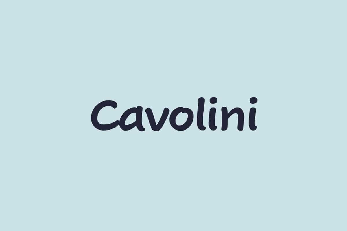
About Cavolini Font
I first reached for Cavolini Font while working on a set of friendly quote graphics for social media. I wanted something that felt personal, like a neat notebook hand, but still clean enough for daily use. Many handwritten fonts looked either too messy or too formal, so I gave this one a careful try.
As I tested it, I liked how calm and steady the strokes felt. It did not scream for attention, yet it had charm. I later wrote a short review draft for Free Fonts Lab, and that small test pushed me to explore the font family in more detail.
Font Style & Design Analysis
Cavolini Font is a handwritten typeface with a tidy, rounded look that feels approachable. The letters have a slight casual tilt, but nothing too dramatic. It reminds me of well-practised handwriting from a careful student, with smooth curves and simple forms that stay easy to read at many sizes.
The designer is unknown, at least from the sources I could find with confidence. Because of that, I treated it like a quiet tool rather than a statement piece from a famous foundry. That mindset helped me focus on how it behaves in real layouts, instead of the story around its creation.
The letterforms are open, with wide counters and soft shoulders, which helps the text breathe. Spacing is slightly loose by default, giving lines a relaxed rhythm. In short words and headings, this works very well. In longer paragraphs, I sometimes tighten tracking a little. As a handwritten font style, its strength lies in warm, short messages, labels, notes, and small brand accents. It can struggle in dense body text, where the friendly tone may feel too informal.
Where Can You Use Cavolini Font?
I found Cavolini Font most useful in projects that need a human touch without chaos. For example, it fits quote cards, planners, recipe headers, and light lifestyle branding. At larger sizes, the rounded strokes and even curves feel very inviting, especially on pastel backgrounds or soft photo overlays.
In smaller sizes, the font remains readable, but I try not to go too tiny. The casual handwritten character means fine details can blur on low-resolution screens or cheap prints. I usually keep body copy in a clean sans-serif or serif typeface, then use Cavolini for subheads, callouts, and short notes that highlight key ideas.
For pairing, I like setting Cavolini Font with a neutral geometric sans for clear hierarchy. The handwritten style handles the personal parts – names, tags, side comments – while the companion font carries longer text. This balance works nicely for teacher materials, children’s products, wellness brands, and any visual identity that aims to feel caring but organised.
Font License
Before using Cavolini Font in client work or commercial products, I always check the latest licence details from the official source. Terms can change, and personal use does not always cover branding or merchandise. It is worth spending a few minutes reading the licence so the project stays safe and clear.
After testing it in real layouts, I see Cavolini as a gentle, reliable handwritten option when I need warmth without drama.


Leave a Reply