
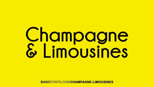

About Champagne & Limousines Font
I tested the Champagne & Limousines Font while working on a clean branding mockup for a small lifestyle label. I needed something modern, light, and readable, without feeling cold or too corporate. The name felt playful, but the look turned out surprisingly calm and tidy.
What drew me in was the balance between softness and order. The curves feel friendly, yet the structure stays disciplined. I used it in headings, taglines, and basic UI labels to see how it behaved across a simple system. For Free Fonts Lab, I also checked how it holds up against other minimalist typefaces in the same space.
Font Style & Design Analysis
This typeface is a sans-serif font, with a clear, modern direction and a slightly casual surface. The strokes are even and controlled, without much contrast. Rounded edges give the font family a gentle tone, so it does not appear harsh on screen. It sits somewhere between everyday utility and quiet elegance.
The designer of Champagne & Limousines Font is generally credited as Nymphont. While details about the full design process are limited, the intent feels clear. It aims for a simple, approachable voice that still looks considered. You can sense a focus on screen use and basic interface readability rather than decorative drama.
The letterforms are compact, with a low visual noise level. The lowercase has open counters, which helps legibility at small sizes. Spacing feels tight but consistent, giving text a tidy rhythm in paragraphs. It shines in short phrases, UI labels, and lean layouts. Long walls of body text can feel slightly cramped, so some extra tracking often helps. As a sans-serif option, its main strength is calm clarity; its limitation is limited personality in very expressive branding.
Where Can You Use Champagne & Limousines Font?
I find Champagne & Limousines Font most comfortable in digital products, light branding, and minimalist layouts. It works nicely in app interfaces, buttons, menus, and small labels because the clean shapes stay legible. On social media graphics, it holds up well for quotes, captions, and overlays on soft photography.
At larger sizes, the smooth curves give headlines a relaxed, modern feel. It suits beauty, lifestyle, and casual tech brands that want to look tidy but not stiff. For long reading, I usually pair it with a more open sans-serif or a gentle serif for body text, while keeping Champagne & Limousines for headings and UI elements.
On print pieces, it performs best on business cards, simple brochures, and product packaging with light content. It is also useful for clean infographics, where you need clear labels without drawing too much attention to the type itself. When pairing, a geometric sans or a subtle serif with more contrast can add character and support a stronger visual identity.
Font License
The licence for Champagne & Limousines Font can vary by source and version, especially between personal and commercial use. I always recommend checking the current licence details from the official distributor before using it in client work or large-scale branding. It is worth confirming usage rights for web, print, and app embedding.
For me, Champagne & Limousines works best as a quiet, dependable helper in clean digital layouts, rather than the star of a brand. When I need simple, readable text with a soft edge, it stays on my shortlist.


Leave a Reply