

About Cherry Bomb Font
I first picked up the Cherrybomb font while building a bright poster series for a local summer fair. I needed something loud, playful, and a bit chaotic, but still readable from a distance. This typeface stood out right away among many safe, clean options.
What pulled me in was its bold personality and comic-style energy. The font looked like it could carry a whole visual identity on its own. I decided to test it in headlines, badges, and short taglines, then wrote down my notes for Free Fonts Lab so other designers could see how it behaves in real layouts.
Font Style & Design Analysis
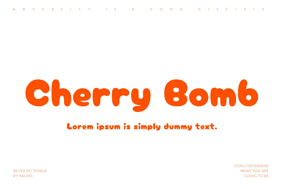
Cherry Bomb Font is a pure display typeface, built for attention rather than long reading. The shapes feel chunky, round, and full of bounce, almost like hand-drawn bubble letters. It gives off a candy-like, comic-book mood, which instantly sets a playful tone in any design.
The designer is unknown, at least from the sources I could access while testing. Because of that, I focused fully on how the font family behaves in real projects instead of any brand story. Naming aside, it feels like someone tried to bottle up childhood doodles into a usable digital typeface.
The letterforms are wide, with strong curves and tight inner spaces, so the text block looks dense and lively. Spacing is fairly close by default, which helps build solid, punchy headlines, but can feel cramped in longer words. The rhythm is irregular in a charming way, but that same quirk makes it less ideal for serious or minimal layouts. As a display font style, its strength lies in short, loud phrases rather than extended copy.
Where Can You Use Cherry Bomb Font?
I find Cherry Bomb Font works best in posters, party flyers, event branding, and playful packaging. Use it at large sizes where the curves and bold strokes can really breathe. It grabs attention quickly, especially when paired with bright colours and simple graphic shapes in the background.
For small sizes, the tight counters and heavy forms start to merge, so I avoid it for body text, captions, or app interfaces. I usually pair it with a clean sans-serif or simple serif typeface for supporting copy. That contrast lets the display lettering shout while the secondary font keeps things readable and grounded.
This font suits children’s products, sweets, snacks, comics, YouTube thumbnails, and youth-focused campaigns. It can also work for seasonal graphics, like summer sales or fun event logos. When I build a layout with it, I keep word counts short, use generous line spacing, and leave plenty of white space around the typography to avoid visual clutter.
Font License
The licence for Cherry Bomb Font can vary depending on where you download it. Always check the official source to see what is allowed for personal and commercial use. I recommend reading the licence details carefully before using it in client work or paid projects.
My honest takeaway: I reach for Cherry Bomb Font when a project needs carefree fun, not subtlety, and I use it in small, focused doses.


Leave a Reply