
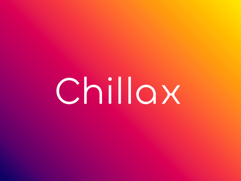

About Chillax Font
I first tried the Chillax Font while working on a relaxed lifestyle brand that needed a calm, modern voice. The client wanted something clean, but not cold or boring. As I tested options, this typeface kept catching my eye because it felt soft yet confident at the same time.
What pulled me in was its gentle geometry and friendly curves. It looked simple enough for clear reading, yet had small details that gave it character. I decided to test it in headings, body text, and UI labels, then wrote up my notes for Free Fonts Lab so other designers could see how it behaves in real layouts.
Font Style & Design Analysis
The Chillax Font is a modern sans-serif typeface with a calm, rounded presence. Its shapes sit between strict geometry and human warmth. The overall direction feels minimalist, but not harsh. Strokes are even, counters are open, and there is a quiet softness in the curves that makes the font style feel approachable.
The exact creator of this font is designer unknown, at least from the sources I could access. That means I treated it purely by what I saw on screen and in print, without any brand story to guide me. I simply looked at how the font family behaved in grids, text blocks, and mixed typography systems.
The letterforms show good balance between straight lines and round joints. Lowercase shapes feel slightly wider than strict neo-grotesque styles, which helps with breathing space. Spacing is on the relaxed side, giving an easy reading rhythm. This works beautifully for headings and medium-length text, but for very dense paragraphs you may want to tighten tracking a little. The mood sits somewhere between friendly tech and lifestyle editorial, which is both a strength and a small limitation if you need something very formal or very playful.
Where Can You Use Chillax Font?
In my tests, the Chillax Font worked well for brand identities that want a soft modern tone. Lifestyle products, wellness brands, creative studios, and casual tech products can all use this sans-serif for a gentle, trustworthy feel. It also suits portfolios and personal sites where you want clarity without losing personality.
At large sizes, its rounded details and clear shapes really shine. Display headings, hero text, and social media graphics look tidy and calm. When I used it in UI labels and navigation, it stayed readable and stable. For long paragraphs at small sizes, I found it still legible, though I sometimes adjusted line height to keep the text feeling open.
For pairing, I liked using this typeface as the main sans-serif workhorse, then adding a subtle serif for quotes or small highlights. A light, simple serif with narrow contrast pairs nicely and keeps the visual identity balanced. You can also mix different weights inside the same font family to build hierarchy instead of switching typefaces, which helps keep designs consistent.
Font License
Licensing for the Chillax Font can change depending on where you get it. Always check the official source for current terms, especially for commercial projects. Read whether personal use, client work, or app embedding is clearly allowed before you include it in any paid or large-scale design.
My honest takeaway as Ayan Farabi: this is a calm, useful sans-serif that rewards careful spacing and pairing. When used with intention, it can quietly support a wide range of modern brands without shouting for attention.


Leave a Reply