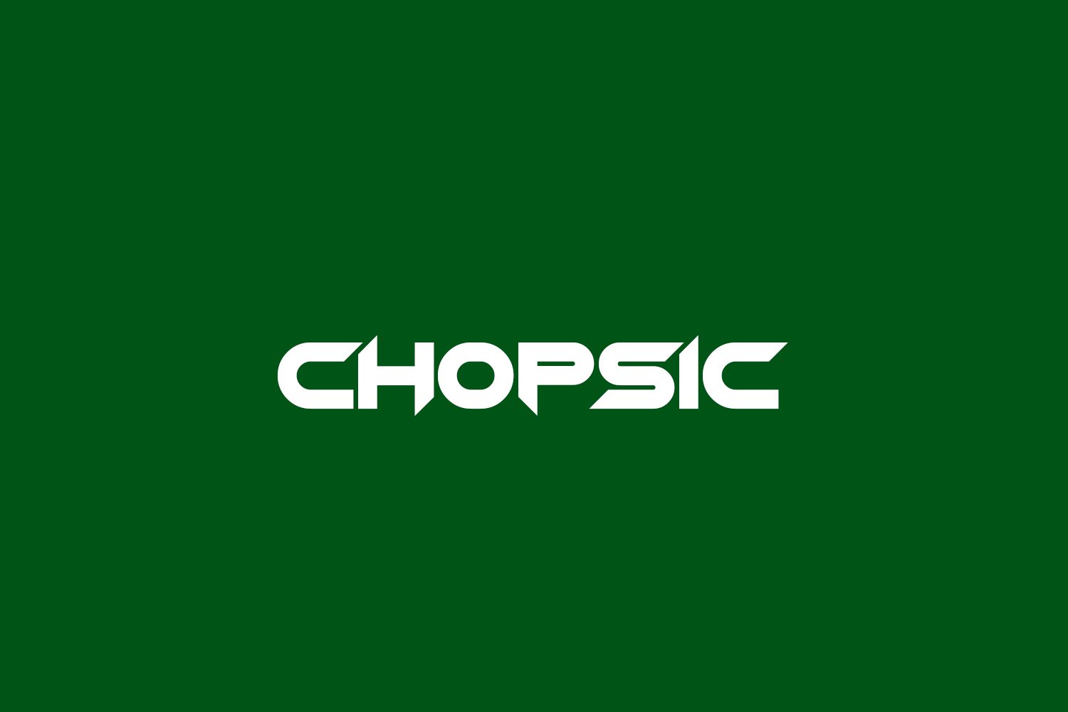
About Chopsic Font
I came across Chopsic Font while searching for a loud, playful title style for a poster set. I needed something bold, a bit strange, and easy to spot from far away. Many options felt either too clean or too messy, but this one sat right in the middle.
I tested it on a music event poster series for a personal concept project at Free Fonts Lab. The font helped me push the mood into a fun, slightly chaotic space without losing readability. That balance between weird and workable made me want to explore it more in real layouts.
Font Style & Design Analysis
Chopsic Font is a pure display typeface, built for impact rather than long reading. The letters feel chunky, sharp, and a bit cartoonish. You get a strong comic and experimental vibe, like something pulled from a DIY zine or an underground gig flyer. It instantly sets a loud, informal tone.
The designer is unknown, but the font family shows a clear sense of intention. It looks like someone aimed to merge comic-book exaggeration with a raw, poster-style attitude. Even without a famous foundry name behind it, the design choices feel confident and deliberate, rather than random or careless.
The letterforms have uneven strokes, jagged curves, and a slightly distorted rhythm that gives the typography a wild, energetic feel. Spacing is tight, so words form strong visual blocks, which works well for big headlines. At very small sizes, the quirky shapes lose clarity. As a display font style, it shines in short text, titles, and logos, but it becomes tiring for long copy or detailed UI work.
Where Can You Use Chopsic Font?
In real use, Chopsic Font works best when you treat it as a visual shout. I used it for poster titles at large sizes, and it held its shape well from a distance. The odd angles and thick strokes become a clear graphic element, almost like part of the illustration rather than just text.
It suits projects aimed at younger or playful audiences: music flyers, streetwear graphics, game titles, or comic-inspired branding. On social media graphics, it grabs attention fast, but you need to keep the words short. For long captions or body copy, pair it with a simple sans-serif or serif typeface to keep reading easy.
At smaller sizes, the quirky curves and tight spacing can feel cramped and noisy. I would avoid it for menus, UI labels, or dense editorial layouts. Instead, treat it as a headline tool, logo idea, or wordmark for bold visual identity concepts. Used in moderation with clean supporting fonts, it can bring a strong, memorable personality to a layout.
Font License
The licence for Chopsic Font can vary depending on where you download it. Always check whether it allows both personal and commercial use before using it in client work. I strongly recommend reading the official licence details each time, as terms may change over time.
For me, Chopsic Font is a fun, rough-edged tool I reach for when a project needs bold energy and a slightly chaotic voice, as long as I keep it in short, focused doses.


Leave a Reply