

About Cinema Sunday Font
I first tried the Cinema Sunday Font while working on a small poster series for a local film club. I needed a calm, classic voice that still felt inviting and clear on print. Many serif options felt either too stiff or too fancy, so I started to look a bit deeper.
What caught my eye was how balanced and composed this font looked. The forms felt familiar, almost like an old film title, but without heavy nostalgia. I decided to test it in headings, credits, and short paragraphs. For Free Fonts Lab, I also wanted to see how it behaved across different layouts and sizes.
Font Style & Design Analysis
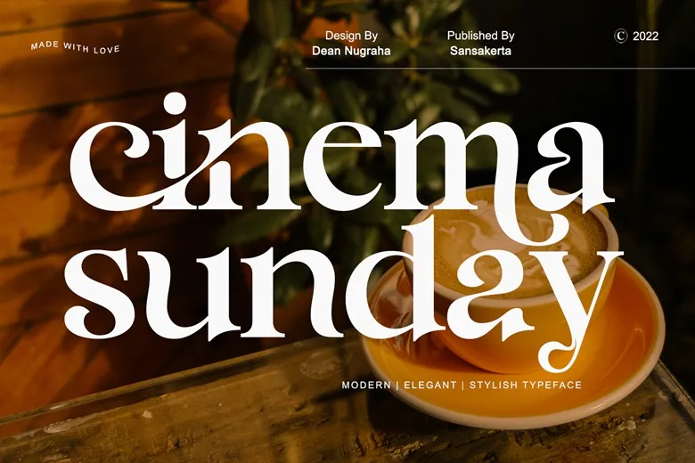
This is a serif typeface with a gentle, cinematic tone. The strokes are moderate in contrast, so nothing feels too sharp or aggressive. The serifs are soft and slightly rounded, which gives the font style a friendly, human presence. It sits comfortably between formal and relaxed, which makes it quite approachable.
The designer is designer unknown, at least from the sources I could access. That makes it harder to trace its exact design roots, but the intentions still feel very clear. The font family seems shaped with movie titles and editorial layouts in mind, rather than strict corporate documents.
The letterforms show tidy proportions, with open counters and a steady rhythm across lines. Spacing is on the slightly loose side, which helps readability in headlines and short blocks of text. At smaller sizes, the fine details in the serifs can start to soften, so I would avoid dense body copy. Its strengths sit in titles, pull quotes, and short intros, where its classic mood can shine without strain.
Where Can You Use Cinema Sunday Font?
I see the Cinema Sunday Font working very well for film posters, event titles, and simple brand wordmarks. If you design for book covers, especially romance or drama, this serif voice can hold a gentle sense of story. It can also support lifestyle blogs or culture magazines that prefer a calm visual identity.
At large sizes, the shapes feel confident and elegant, and the spacing breathes nicely. The serifs keep the typography grounded, while the moderate contrast avoids flashy drama. For smaller captions or UI labels, I would pair it with a clean sans-serif, letting this serif stay in prominent, display-level roles rather than tiny text.
In layouts, I like pairing this font with a neutral geometric sans for body copy. That mix gives a good contrast between classic and modern. For more expressive projects, you could also use a soft script only for accents, while keeping Cinema Sunday Font as the main anchor. It suits audiences who enjoy subtle, film-inspired atmosphere without loud decoration.
Font License
The licence for Cinema Sunday Font can change depending on where you download it. Some sources may allow personal use only, while others may include commercial rights. I always recommend reading the official licence carefully before using it in client work or paid projects.
After testing it in real layouts, I see it as a gentle, film-ready serif that works best when used with intention and plenty of space.


Leave a Reply