

About Citadel Script Font
I first picked up Citadel Script Font while working on a wedding stationery set that needed a formal, classic mood. The brief called for something elegant, but not too sweet or childish. I wanted a script that felt traditional, yet still readable in print and on screen.
The old-world charm of the curves drew me in right away. It reminded me of engraved invitations and fine certificates. I decided to test it for headings, names, and short lines of text, then reviewed my results for Free Fonts Lab. That first trial showed both its charm and its limits quite clearly.
Font Style & Design Analysis
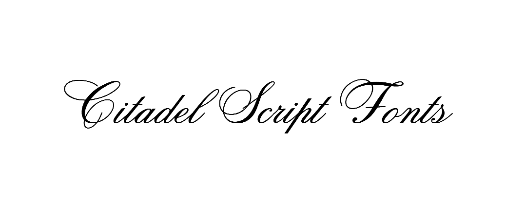
Citadel Script Font is a formal script typeface with a very classic, engraved look. The forms feel like they belong on vintage certificates, royal crests, or high-end invitations. Strokes are refined, with sweeping entry and exit curves that link letters into smooth, almost calligraphic lines.
The exact designer is unknown, at least from the sources I checked during testing. The font family feels like it was inspired by traditional copperplate or engraved pen work, but translated for digital typography. It carries a strong sense of heritage, which gives it a clear stylistic direction and makes it easy to recognise in a layout.
The letterforms are narrow, with tall x-heights and tight, looping connections. Spacing is quite compact, especially in lowercase pairs, so words can look dense at small sizes. The rhythm is flowing but slightly rigid, which supports formal themes more than casual ones. Its biggest strengths are decorative headlines, names, and short phrases. Longer text blocks, or very tiny sizes, tend to feel cramped and less legible, which is a key limitation of this script font style.
Where Can You Use Citadel Script Font?
I see Citadel Script Font working best in projects that aim for prestige or ceremony. Think wedding invitations, certificates, event programmes, or luxury packaging. It shines when you use it for names, titles, and short taglines, especially in print. At larger sizes, the curves and loops feel refined and intentional.
On screens, the font still works well for logos, hero headlines, and social graphics, as long as you keep the size generous. Small captions or long paragraphs break down because the tight letter spacing reduces clarity. I usually pair it with a clean sans-serif for body text, so the visual identity feels balanced and easy to read.
For brand marks, the font style suits high-end boutiques, jewellery, beauty products, and formal events. It can also work in historical or royal-themed designs where tradition matters. When I use this script typeface, I plan the hierarchy carefully: decorative lines at the top, simple support text beneath, with plenty of white space to let those ornate letterforms breathe.
Font License
Before using Citadel Script Font in any project, especially for a client or commercial work, always check the official licence terms. Some sources allow personal use only, while others may offer broader rights. I recommend confirming usage limits, embedding rules, and commercial permissions from the original provider every time.
My honest takeaway as Ayan Farabi: I treat this font as a specialised tool for formal, decorative moments, not a workhorse, and it rewards that careful, selective use.


Leave a Reply