
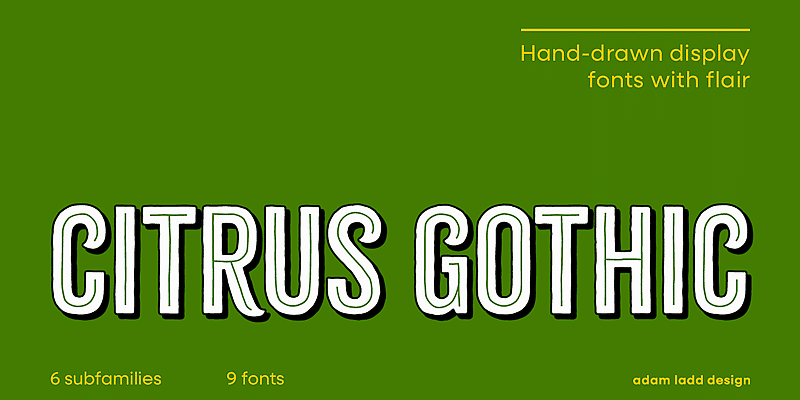

About Citrus Gothic Font
I first picked up Citrus Gothic Font while working on a poster that needed a clean, modern voice but with a slightly quirky edge. I wanted a typeface that felt friendly, not cold, and still strong enough for bold headlines. That search led me to test this font in detail for Free Fonts Lab.
What kept me interested was how simple it looked at first, yet how carefully balanced the shapes felt once I started using it. The glyphs hold together well as a font family, and I could see it fitting many branding tasks where clarity and character both matter.
Font Style & Design Analysis
Citrus Gothic Font is a sans-serif typeface with a clear, upright stance and steady structure. The strokes feel even and controlled, without sharp contrast or decorative tricks. It sits in that space between strict geometric and humanist styles, so the typography feels clean but not stiff. In layouts, the shapes give a quiet confidence rather than shouting.
The designer is unknown, at least from what I could find through normal research channels. That said, the drawing quality suggests a careful hand behind it. The consistency in curves, joins, and terminals shows that someone thought hard about spacing and weight. It does not feel like a quick or careless project, more like a measured design.
The letterforms have gentle curves, slightly softened corners, and open counters that help readability. Spacing is on the relaxed side, which works nicely for headlines and short text blocks. The rhythm is steady, so lines look tidy and even. The mood sits somewhere between friendly and neutral, making it useful for everyday communication. Its main strength is display work; for long paragraphs, the wide feel can start to look a bit airy, so I treat it more as a headline or short-copy font style.
Where Can You Use Citrus Gothic Font?
In my tests, Citrus Gothic Font worked best in branding pieces that needed clarity with a hint of personality. I used it on a food poster, some social media graphics, and a simple landing page hero. At large sizes, the sans-serif structure holds up very well, and the clean letterforms stay sharp and legible.
For small sizes, such as body text or captions, it remains readable, but the slightly generous spacing can make long paragraphs feel loose. I would not choose it as the main text face for a long article or book. Instead, I pair it with a more compact serif for body copy, letting Citrus Gothic Font handle headings, pull quotes, and short UI labels.
This typeface suits modern brands, casual cafes, creative studios, and lifestyle products that need a friendly visual identity. It can work nicely on posters, packaging, event graphics, and simple logo wordmarks. When I pair it with another sans-serif, I look for something more condensed or neutral, so the contrast in weight and rhythm adds interest without clashing.
Font License
The licence for Citrus Gothic Font can change depending on the source, and terms may differ for personal and commercial work. I always recommend checking the official font licence before using it in client projects, large campaigns, or products. Make sure the allowed usage matches your needs and your client’s expectations.
For me, Citrus Gothic Font has become a handy option when I need a calm, clean sans-serif with a soft edge. I reach for it when a project wants clarity, but still needs to feel human and approachable.


Leave a Reply