
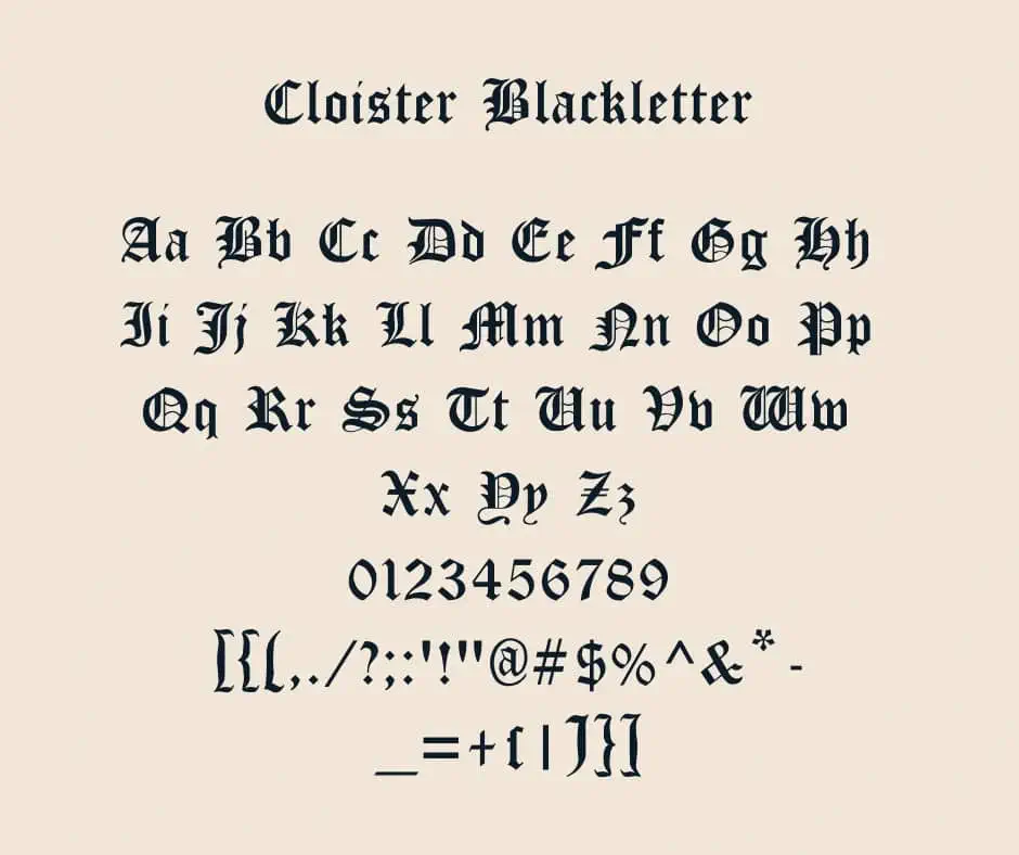

About Cloister Black Font
I ran into Cloister Black Font while searching for a bold, historic look for a poster series about medieval art. The name felt familiar, but the shapes still surprised me when I started testing it. I wanted a typeface that looked serious, old, and a little dramatic.
I decided to try it in a heading-heavy layout for a gallery event. The project needed strong mood, but also clear structure. That made it a good moment to see how this font behaved in real use, not just in a sample sheet. At Free Fonts Lab we often test fonts this way, inside full page designs.
Font Style & Design Analysis
Cloister Black Font is a classic blackletter typeface with sharp, dense strokes and a clear gothic tone. The vertical lines are heavy, and the curves feel tight and controlled. It carries that traditional, church-text feeling, but with enough clarity to work in modern layouts when used with care.
The original design goes back to metal type history, and the digital version keeps much of that flavour. In many digital libraries the designer is unknown, or at least not clearly credited. That lack of clear authorship is quite common with older blackletter revivals, especially those adapted from historic sources.
The letterforms show strong texture: tall verticals, broken curves, and compact counters that form a dark, even colour on the page. Spacing is tight, so words feel like blocks instead of loose lines. This gives the font powerful rhythm, but it hurts readability in long text. It shines in short titles, logos, or initials and struggles in small body copy, where thin details can close up and become hard to read. As a blackletter font family, it brings weight and tradition, but it demands breathing room and thoughtful layout.
Where Can You Use Cloister Black Font?
I find Cloister Black Font most effective in projects that need a historic or gothic mood. Think metal band logos, beer labels, medieval events, or fantasy book covers. At large sizes, the shapes look strong and intentional. The heavy strokes and angular forms help build a very clear visual identity.
At smaller sizes, the same details start to blend together. Thin spaces between strokes close up, and the text becomes hard to scan. For that reason, I avoid using it for body text or long paragraphs. Instead, I pair it with a clean serif or sans-serif for supporting text. A simple, neutral secondary typeface lets the blackletter headlines breathe.
In layout work, I like to give this font lots of space around it: wide margins, fewer words, and clear hierarchy. It works nicely on posters, album covers, certificates, or branding that leans into heritage and tradition. It is less suited for friendly apps, children’s content, or highly accessible interfaces, where quick readability matters more than atmosphere.
Font License
The licence for Cloister Black Font can vary between sources, especially because it is an older design. Some releases allow personal use, while commercial use may need a paid licence or special permission. I always recommend checking the current licence details from the official source before using it in client or commercial work. My own use stays cautious until those terms are clear.
For me, this font works best as a focused tool, not a general solution. When the project truly needs heavy, historic blackletter energy, it earns its place in the layout.


Leave a Reply