

About Clueless Font
I first reached for Clueless Font while working on a small retro film poster series. The client wanted something playful, loud, and very 90s, but still readable from a distance. I was looking through my font library and this typeface instantly stood out with its bold, teenage-comedy energy.
The chunky shapes and high-contrast curves made me think of glossy VHS covers and bright cinema signage. I decided to test it across titles, taglines, and a few mock social posts for Free Fonts Lab. I wanted to see if the style stayed strong outside a classic movie poster layout and still kept that fun, nostalgic tone.
Font Style & Design Analysis
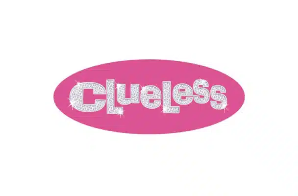
Clueless Font is a pure movie display typeface with a clear 90s teen-film attitude. The letters feel big, confident, and slightly exaggerated, almost like hand-cut title cards from old film promotions. It is not subtle at all, and that direct energy is exactly what gives it character. The font style pushes you towards bold layouts and bright colour palettes.
The designer is unknown, at least from the material I could find. That makes it harder to trace the full design story, but the intent still feels clear. Someone clearly studied classic comedy film posters and built a font family aimed at that world. The strong cinematic flavour makes its movie roots very obvious.
The letterforms are wide, with rounded corners that soften the loud shapes. Counters stay open, so the words remain readable, even in busy layouts. Spacing is quite tight by default, which works well for big titles but can feel cramped in long lines. The rhythm suits short phrases, names, and taglines. It shines in bold, centred compositions, but it struggles in body text, captions, or very formal visual identity work.
Where Can You Use Clueless Font?
I see Clueless Font working best in anything that needs a clear movie vibe, especially teen or comedy themes. It fits posters, streaming thumbnails, DVD or Blu-ray covers, and promo banners. At large sizes, the shapes feel full of personality, and the playful mood hits you right away. It almost invites bright gradients and playful patterns.
In smaller sizes, like app UI labels or dense paragraph text, it loses clarity quite fast. The chunky forms and tight spacing make small text feel heavy and crowded. I prefer using it for headlines, logos, wordmarks, and short pull quotes. For supporting text, I usually pair it with a simple sans-serif or a clean serif to keep the layout calm and readable.
For youth brands, school events, party flyers, and nostalgic 90s-style designs, this typeface can be very effective. It speaks well to younger audiences and to adults who grew up with that film era. I often design the main title in Clueless Font, then bring in a neutral companion font for details, keeping the hierarchy clear and the typography balanced.
Font License
Before you use Clueless Font in any project, especially client or commercial work, always check the official licence terms from the original source. Some versions allow only personal use, while others may permit wider commercial usage. I strongly recommend confirming the licence each time, as terms can change without notice.
For me, this typeface is a fun, focused tool: great when I want strong 90s movie energy, but too specific for everyday work. Used with care, it can give the right project a very memorable voice.


Leave a Reply