

About Cochin Font
I first reached for Cochin Font while working on a small book cover for a quiet literary novel. I needed a serif that felt classic, but not stiff or cold. Many book serifs looked heavy or too serious. Cochin offered a softer, more human voice that still felt grown-up and careful.
That mix of grace and calm control made me curious. I tested it in headings, pull quotes, and long text layouts. As I adjusted sizes and spacing, I saw both its charm and its limits. I later wrote up my notes for Free Fonts Lab, because this typeface rewards careful, thoughtful use.
Font Style & Design Analysis
Cochin Font is a serif typeface with a light, elegant profile and sharp, fine details. The contrast between thick and thin strokes is quite high, which gives it a refined, almost delicate feeling. It does not shout. Instead, it speaks in a quiet, literary tone that suggests books, essays, and cultured environments.
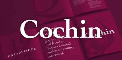
The original design goes back to early twentieth-century French metal type, usually linked to Georges Peignot, though digital versions come from different foundries. You may notice small shifts in weight and spacing between versions, which can affect print versus screen use. When I test a Cochin font family, I always check which cut I am working with before finalising any layout.
The letterforms have narrow proportions, fine serifs, and elegant curves, especially in the lowercase a, g, and italic styles. Spacing feels slightly tight by default, so I often open the tracking a touch for titles. The rhythm in text can feel a bit nervous on low-resolution screens, but in print it settles into a gentle, bookish texture. Its strengths lie in headings, short paragraphs, and refined editorial work, rather than rough or highly dynamic branding.
Where Can You Use Cochin Font?
I find Cochin Font most at home in book covers, poetry collections, literary magazines, and calm, text-led posters. At larger sizes, its serif details and stroke contrast look crisp and elegant. Chapter titles, pull quotes, and opening pages benefit from that refined mood. It suits brands that want a cultured, quiet voice.
For body text, especially on screen, I use it with care. At small sizes, the high contrast and fine serifs can feel fragile and a little hard to read. In print, with good paper and proper leading, longer paragraphs can still work well. On digital interfaces, I usually pair this serif with a more robust sans-serif for main text, keeping Cochin for headings and accents.
In terms of pairing, it works nicely with simple geometric or humanist sans-serif families, which balance its delicate curves. I avoid mixing it with very expressive display fonts, because the overall page can start to look fussy. When used as the main serif in a visual identity, I keep colour palettes muted and layouts clean to let its typography speak clearly.
Font License
Licensing for Cochin Font can vary between versions and foundries, so I never assume terms. Before any client or commercial project, I always check the official source for current licence details, usage limits, and embedding rights. For personal experiments, testing is usually fine, but professional work deserves a careful licence review.
My honest takeaway as Ayan Farabi: Cochin rewards designers who slow down and use it with intent. When the project suits its calm, literary voice, this serif can add a quiet depth that louder fonts often miss.


Leave a Reply