

About Commando Font
I came across Commando Font while searching for a bold title style for a game poster job. I needed something loud, blocky, and tough, but still readable. This typeface stood out because the shapes felt direct and confident, without strange gimmicks.
I decided to test it on a few mock covers and social banners for that project. The heavy weight and sharp edges gave the layout a clear focus point. On Free Fonts Lab, we often try display faces in real layouts, and this one behaved better than I expected for fast, punchy headlines.
Font Style & Design Analysis
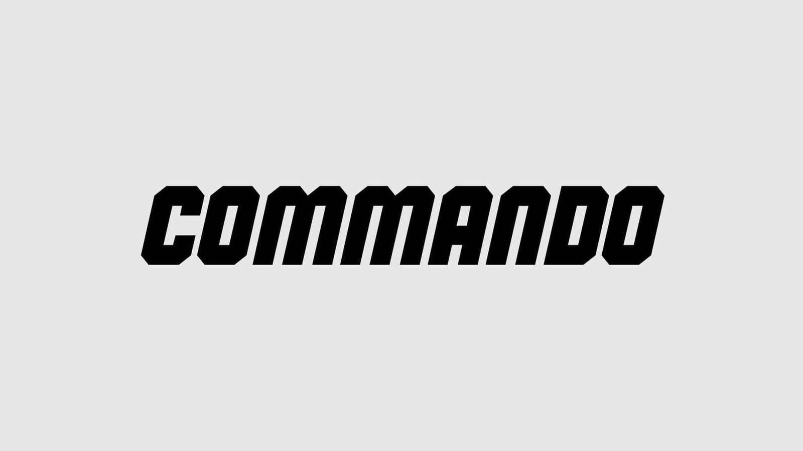
Commando Font is a pure display typeface, built for impact rather than long reading. The letterforms are thick, square, and quite compact, which gives it a military or action-movie mood. It feels like something you would see on a game cover, film poster, or bold logo for an extreme brand.
The designer is unknown, at least from the sources I could trace with confidence. That makes it a bit harder to place in a design lineage, but the intent is clear. It follows the tradition of strong action-display fonts, with a focus on power and clarity rather than subtle detail.
The uppercase set carries most of the personality, with tight counters and straight cuts on many strokes. Spacing feels slightly narrow, which suits large titles but can look cramped if you track it too tight. The rhythm is blocky and steady, so it works well in short lines. As a display font family, it starts to struggle in body copy, especially at small sizes, but for loud headings it does the job.
Where Can You Use Commando Font?
I see Commando Font working best in projects that need a strong, action-led visual identity. Think shooter or war games, tactical sports brands, energy drink concepts, or bold event posters. It can also support metal or rock themes, as long as the rest of the typography keeps things balanced.
At large sizes, the font style stays clean and readable, even on busy backgrounds. For smaller text, the tight letterforms lose clarity, so I would avoid using it for paragraphs or UI labels. Instead, I pair it with a simple sans-serif for body copy, then keep Commando only for titles, taglines, or key numbers.
On social media graphics and banners, it works nicely when you give it space to breathe. Wider margins around the text help the heavy shapes stand out. In logo work, I found it more fitting for wordmarks with few characters, like short names or acronyms. Long names need careful kerning and maybe some manual tweaks to keep the spacing from feeling too dense.
Font License
Before using Commando Font in any paid or client project, you should always check the official licence details from the source. Terms for personal and commercial use can change over time, and some free fonts have limits. I never rely only on third-party notes when planning client work.
My honest takeaway as Ayan Farabi: I reach for this font when I want strong, no-nonsense display typography that shouts without becoming messy.


Leave a Reply