

About Coolvetica Font
I first reached for the Coolvetica Font while working on a retro poster set for a small music event. I needed a tight, bold, 70s-inspired look that still felt clean and modern. Many options felt either too stiff or too playful, so this one sat in a very useful middle ground.
What pulled me in was its smooth, rounded shapes and dense lines. It looked familiar yet fresh, and I wanted to see how it behaved in real layouts. I tested it across titles, short taglines, and a few mock brand logos for a feature on Free Fonts Lab, just to understand where it actually shines and where it struggles.
Font Style & Design Analysis
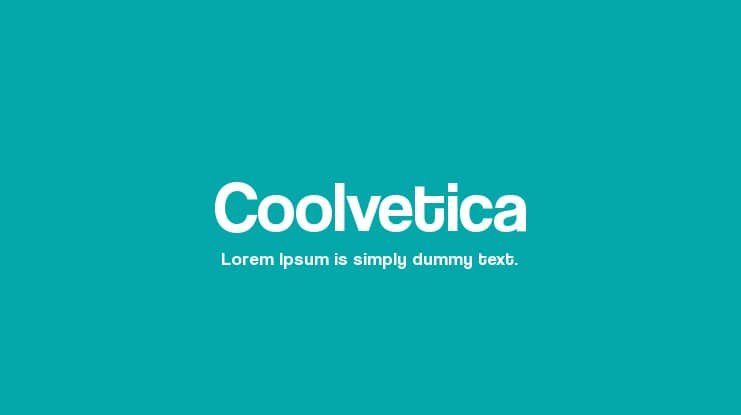
The Coolvetica Font is a sans-serif typeface with a clear nod to 1970s display typography. Its structure is compact and heavy, with very tight spacing that pushes letters close together. The shapes feel soft and rounded, which gives the font a friendly, almost bubble-like presence while still sitting firmly in a clean geometric space.
The original design is by Ray Larabie, and it has become quite well known within digital typography circles. You can feel that it was drawn with posters and large headings in mind, not long reading text. That design intent shows in the proportions, the heavy strokes, and the dramatic curves on many of the characters.
When I look closely at the letterforms, I see a strong rhythm built from tall x-heights and minimal contrast. The counters are tight, and the spacing is dense, which works well for bold headlines but can feel cramped in longer lines. The mood leans fun, urban, and nostalgic. As a sans-serif font family, it excels at eye-catching display work, but it is less suited to body copy or small captions where clarity and breathing room matter more.
Where Can You Use Coolvetica Font?
I find the Coolvetica Font most effective in large sizes, like posters, hero banners, and bold social graphics. At those scales, the tight spacing and thick strokes create strong impact without hurting legibility. It works nicely for event branding, album covers, and vintage-style ads that want a clear 70s or early 80s visual identity.
In smaller sizes, especially below medium text on screen, the dense letterforms start to merge and feel heavy. For that reason, I avoid using it for paragraphs, UI labels, or long product descriptions. Instead, I pair it with a more neutral sans-serif or a calm serif for body text, letting Coolvetica handle headlines, callouts, and short, punchy phrases.
For clients who want a friendly yet bold brand voice, this typeface can shape logos, wordmarks, and section titles quite well. It speaks to audiences who enjoy nostalgia, street culture, or playful minimal design. In layouts, I usually give it plenty of margin and whitespace, and sometimes increase tracking slightly, so the font style can breathe and the typography feels more balanced.
Font License
From a licensing point of view, the Coolvetica Font can come with different terms depending on where you get it. Some sources may allow personal use only, while commercial projects often need a proper licence. I always recommend checking the official licence details from the original source before using it in client or paid work.
My honest takeaway as Ayan Farabi: Coolvetica is great when I treat it as a bold display tool, not a universal workhorse, and it rewards careful, thoughtful use.


Leave a Reply