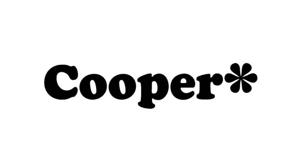
About Cooper Font
I first reached for Cooper Font while working on a small café brand that needed a soft, friendly serif with some personality. The client wanted something warm and approachable, but not childish or messy. I had used many clean modern serifs before, yet nothing felt cosy enough for this project.
What drew me in was the rounded, chunky feel of the letterforms and the subtle retro charm. It looked playful, but still grounded and readable. I decided to test it across menus, cup designs, and a simple website mock-up for Free Fonts Lab. I wanted to see if the font could carry a whole visual identity without feeling like a novelty choice.
Font Style & Design Analysis
Cooper Font is a serif typeface with a bold, rounded look that stands apart from more formal book serifs. The thick strokes and curved terminals give it a soft, almost bubbly presence on the page. It has a clear vintage flavour, yet it still feels usable in modern layouts when handled with some restraint.
The original Cooper style is often linked to early twentieth-century American advertising, but in many digital versions the designer is either adapted or listed as designer unknown. Different releases may vary slightly in weight, contrast, and spacing. When I test any Cooper-inspired font family, I always check which cuts are included, because that affects how far I can push the typography system.
The letterforms are wide and open, with generous curves and very little sharp detail. This creates a relaxed rhythm, but also makes the font quite heavy on the line. The spacing feels tight at large sizes, so I usually add a bit of tracking for headlines. In small text, the bold shapes can crowd together, which limits its use for long reading. As a serif, it brings warmth and character, but I treat it as a display-focused option rather than a neutral workhorse.
Where Can You Use Cooper Font?
I find Cooper Font works best in branding where friendliness and nostalgia are key. Food packaging, café logos, children’s products, and casual event posters benefit from its chunky serif charm. At large sizes, the soft curves feel inviting and memorable, which helps a brand stand out without looking aggressive.
In smaller sizes, the heavy forms start to blend a bit, especially in dense paragraphs. Because of that, I avoid using it as a body text font style. Instead, I pair it with a clean sans-serif for captions and long copy. This way the Cooper-based headline carries the mood, while the supporting typeface keeps everything readable and balanced.
For layouts, I like using short phrases or single words set in Cooper for emphasis. It shines in menu section titles, product names, badges, and hero headlines. When I build a visual identity system, I usually limit the font family to display roles and rely on a calmer serif or sans for the rest. Used this way, its personality feels strong but not overwhelming.
Font License
Licensing for Cooper Font can differ between foundries and releases, so I never assume rights. Before using it in client work or commercial projects, I always check the official source for clear licence terms, including desktop, web, and logo usage. For personal experiments, I still confirm that the download allows basic testing.
In my own practice, Cooper remains a type choice I reach for when a project needs warmth, softness, and a hint of retro charm, but I keep it in display roles so its character supports the design instead of taking it over.


Leave a Reply