

About Cooperplate Font
I came to the Cooperplate Font while checking serif options for a book cover brief. The client wanted something solid, classic, but not too stiff. I needed a typeface that felt grounded and serious, yet still friendly on the page.
As I tested it, I noticed how its shapes balanced strength and softness. That mix made me curious enough to explore it deeper for Free Fonts Lab. I wanted to see how far I could push it in real layouts, not just in a quick mock-up.
Font Style & Design Analysis
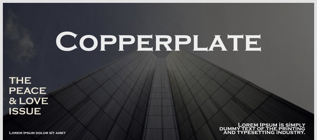
This is a serif typeface with a very carved, engraved look. The strokes feel sturdy, with flat, crisp serifs that almost look etched into stone or metal. It carries a formal, old-world mood, but the round curves stop it from feeling cold or harsh.
The exact origin of this font family is unclear, so I will treat the designer as designer unknown. The design direction clearly borrows from engraved letterforms used on signs, plates, and formal documents. You can feel that heritage in every character.
The letterforms show wide proportions, small contrast between thick and thin strokes, and quite open counters. Spacing is on the tighter side, which gives text a compact rhythm. This works well in headlines and names, but long paragraphs can feel dense. Its strength lies in display work and branding; it is less ideal for heavy body copy.
Where Can You Use Cooperplate Font?
I find Cooperplate Font most effective in titles, nameplates, and short lines where you want a confident voice. It suits certificates, invitations, award graphics, and book covers that need a formal, engraved mood. On posters, large sizes highlight its strong serifs and sculpted edges.
At smaller sizes, the serif details begin to merge a little, especially on screens. For long text, I usually pair this serif with a cleaner body typeface, often a neutral sans-serif. This contrast keeps the layout readable while letting the Cooperplate headings carry the visual identity.
For brand work, I like using it for logos, wordmarks, and taglines aimed at law firms, finance, heritage brands, or premium craft products. It sends a message of trust and tradition. In these settings, careful tracking and generous spacing help the typography breathe and avoid feeling cramped.
Font License
The licence for Cooperplate Font can vary depending on the source where you obtain it. Always check the official licence details for personal and commercial projects before use. I strongly suggest reading the usage terms closely, especially for client work and logo design.
For me, Cooperplate works best when I need a serif that feels engraved, steady, and slightly formal without sliding into cold formality. Used with care and good spacing, it becomes a reliable tool in my typographic kit.


Leave a Reply