
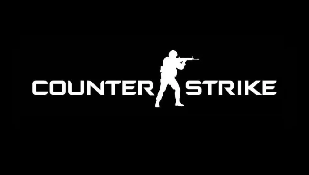

About Counter Strike Font
I first tried the Counter Strike Font while working on a gaming team badge. The client wanted something sharp, bold, and easy to read from a distance. I was already looking at several esports styles for Free Fonts Lab, so this typeface fit nicely into that comparison.
What pulled me in was its strong logo energy. The shapes felt tight and focused, with a clear sense of action. I tested it in mock match posters, stream overlays, and a simple team wordmark. That helped me see quickly where it shines and where it starts to struggle.
Font Style & Design Analysis
The Counter Strike Font is a pure logo typeface, built for short text and strong branding. The design direction leans on sharp corners, compact forms, and a slightly futuristic look. It has a clean, militaristic mood that fits tactical or shooter themes without feeling too busy or decorative.
As far as I can tell, the designer unknown status applies here, since there is no clear credit from the original source. That lack of authorship can be a concern when planning long-term branding, so I always note it in my project files. Knowing the maker often helps with trust, updates, and extended font family options.
The letterforms sit tightly together, with narrow shapes and firm horizontal lines. The spacing works well for one or two words, especially in uppercase. The rhythm becomes dense in longer text, so I would not use it for paragraphs. Its main strength is impact: strong logo marks, headers, and title locks. The limitation is flexibility; as a logo font style, it loses clarity at very small sizes and in long copy.
Where Can You Use Counter Strike Font?
I see the Counter Strike Font working best in game logos, clan tags, and tech-heavy visual identity systems. It also fits tactical brands, airsoft teams, or cyber-themed posters. At large sizes, the typeface feels sharp and confident, with clear edges that hold up well on screen and print.
At medium sizes, such as UI labels or menu headings, it can still work if you give it enough spacing and contrast. For very small text, the tight forms start to blur, so I avoid it for body copy, captions, or interface details. Keeping it for titles only keeps the typography clean and readable.
When I pair this font family, I usually choose a neutral sans-serif for supporting text, something plain and calm to balance its strong character. In layouts, I like placing it with plenty of breathing room around the logo or headline. That space lets the logo category aesthetic speak clearly without competing shapes or noisy backgrounds.
Font License
The licensing for the Counter Strike Font can vary depending on the source where you download it. I never assume it is free for commercial use, even if it looks that way. Before using it in paid client work, I always check the official licence terms carefully and keep a record. For me, it is a useful option when I need a focused, game-ready logo style, but only when the licence conditions are clear and suitable.


Leave a Reply